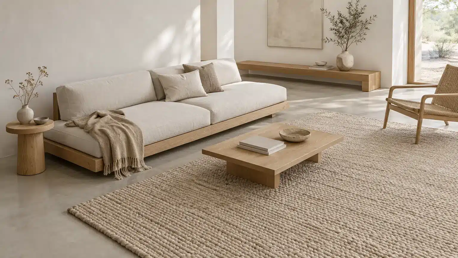
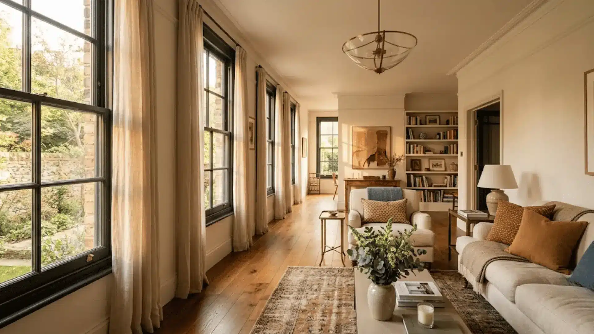
In my experience, long, narrow living rooms tend to feel more like hallways than rooms to relax in.
That extra length pulls your eye straight down the room, and it never really settles. This problem shows up constantly, and it usually has nothing to do with square footage.
Buying smaller furniture would not fix this. It usually just leaves more empty floor to stare at.
The real fix is how you handle traffic flow, furniture scale, focal points, and zoning. That is really what arranging living room furniture comes down to, and it is the same approach designers lean on for tricky room shapes.
Some ideas below are firm rules to follow. Others are layouts you can pick and adjust.
The right one depends on your doorways, windows, fireplace, and how your family spends time in the room.
Before Arranging Furniture, Understand Your Long Living Room
A long living room can show up in different shapes, from narrow rectangular rooms and railroad-style layouts to pass-through spaces and open-concept floor plans with an unusually long footprint.
Many of these rooms also connect to an entry, kitchen, or hallway, which adds to the challenge.
These rooms are tricky because they often force furniture along both long walls, leaving a walkway cutting through the seating area.
Others end up with dead space at one end or a TV and fireplace too far from the couch.
In practice, these layouts often double as living spaces and passageways at the same time, which is exactly why they need a different approach than a standard rectangular room.
9 Rules for Arranging Furniture in a Long Living Room
These are not random tips. They are the principles designers reach for again and again when a room refuses to behave.
1. Map the Main Traffic Path First
Before choosing a single piece of furniture, walk the room and notice where people naturally move through it. Keep that path outside your seating area whenever possible.
A sofa and coffee table with a walkway cut straight between them never feels settled, no matter how nice the pieces are.
Designers who work with long, narrow rooms often keep foot traffic along one side, freeing up the rest of the space for actual living.
2. Choose the Focal Point Before Placing the Sofa
A fireplace, a TV, a large window, or even a striking architectural detail can anchor the room, but only if you decide on it first.
Placing a focal point on a short wall tends to pull the whole layout together. Put it on a long wall instead, and furniture often ends up stretched thin along the sides.
Decide on the anchor early, and the rest of the layout tends to fall into place around it.
3. Do Not Push Every Piece Against the Walls
It is tempting to line furniture along the perimeter in a long room, but this usually stretches the space even more.
A sofa or chair floated slightly off the wall, with circulation allowed around it, reads as intentional rather than accidental.
Even one floating piece can shift how the whole room feels. It is a small move, but it is often the difference between a room that feels planned and one that feels like leftover space.
4. Break Up Excessive Length With Zones
A long room rarely needs to function as one giant seating area. Splitting it into a main seating zone, plus a reading nook, small workspace, or game corner, gives the length purpose instead of making it a problem.
Rugs, lighting, and furniture backs can quietly signal where one zone ends and another begins.
Interior designers frequently recommend multiple smaller groupings for rooms with weird proportions, since one long stretch of furniture rarely feels cohesive.
5. Keep the Furniture Proportional to the Room’s Width
Narrow does not mean tiny. Furniture scaled down too aggressively can leave a room feeling sparse and oddly formal.
Pay attention to sofa depth, chair width, and coffee table size relative to your walking space, not just the length of the room.
A slim profile works better than a small one. The goal is comfortable circulation, not shrinking every piece until the room feels underfurnished.
6. Arrange Some Pieces Crosswise
Placing shorter sofas, loveseats, benches, or console tables across the width of the room, rather than along its length, interrupts the visual pull toward the far end.
This crosswise placement can trick the eye into seeing more width than the room actually has.
Designers often use this trick specifically in narrow spaces, positioning a piece perpendicular to the walls to visually push them outward.
7. Anchor Each Seating Area With a Rug
One oversized rug running the length of the room rarely does what people expect it to. Instead, use a rug for each functional zone, sized to define that specific seating group.
This helps separate a main living area from a reading corner or workspace without adding walls or furniture.
Rug placement is one of the simplest ways to signal where one part of the room ends, and another begins.
8. Give the Ends of the Room a Purpose
The far ends of a long room often become dead space, filled with nothing more than a random chair or an empty corner.
Instead, give each end a job. A reading chair, a small desk, a console with art above it, or even a few plants can turn unused space into something functional.
The difference between filling a space and designing it usually comes down to intention.
9. Size the Walkways Before You Commit
Measure door swings and account for how people will actually move through the finished layout.
A primary walking path generally needs about 30 to 36 inches of clearance, though tighter secondary routes can work with less.
Before buying anything, try mapping the layout with painter’s tape on the floor. It takes a few minutes and can save you from committing to furniture that never quite fits the way you imagined.
Single-Zone Layouts for a Clear, Simple Seating Area
These work best when the room has one clear job: comfortable, focused seating without extra distractions.
10. Sofa Along the Long Wall, Chairs Facing In
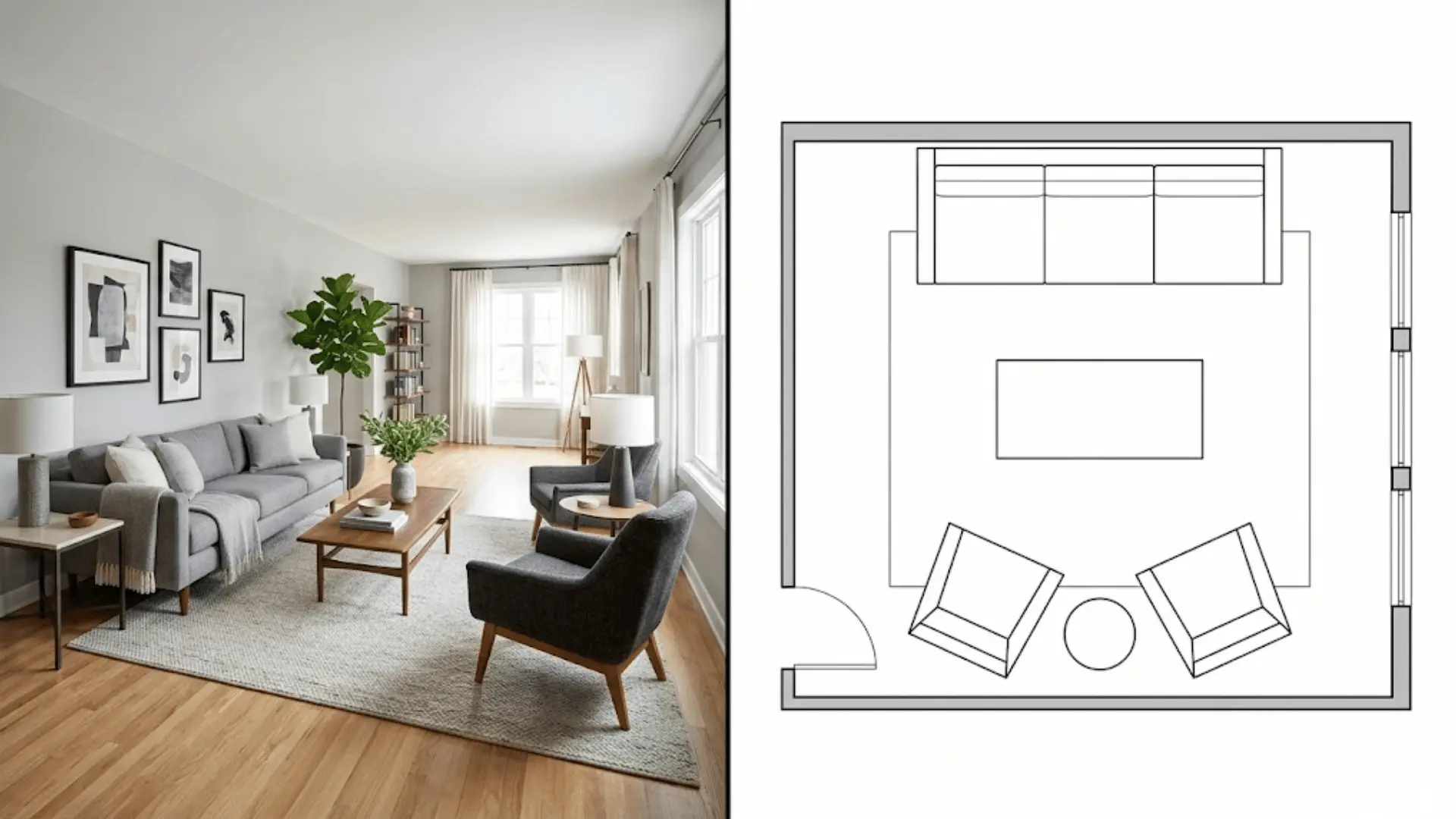
- Suitable For: Rooms with one primary function and no need for extra zones.
- Watch Out For: Leaving too much unused space on either side if the room runs especially long.
The sofa anchors one long wall, with one or two chairs facing it and a coffee table centered between them. This creates a clear, balanced seating group instead of letting furniture drift toward the room’s ends.
It is a dependable starting point when the room does not need to multitask, giving people one obvious place to sit and talk without extra visual clutter pulling focus elsewhere.
11. Sofa Facing a Short-Wall Focal Point
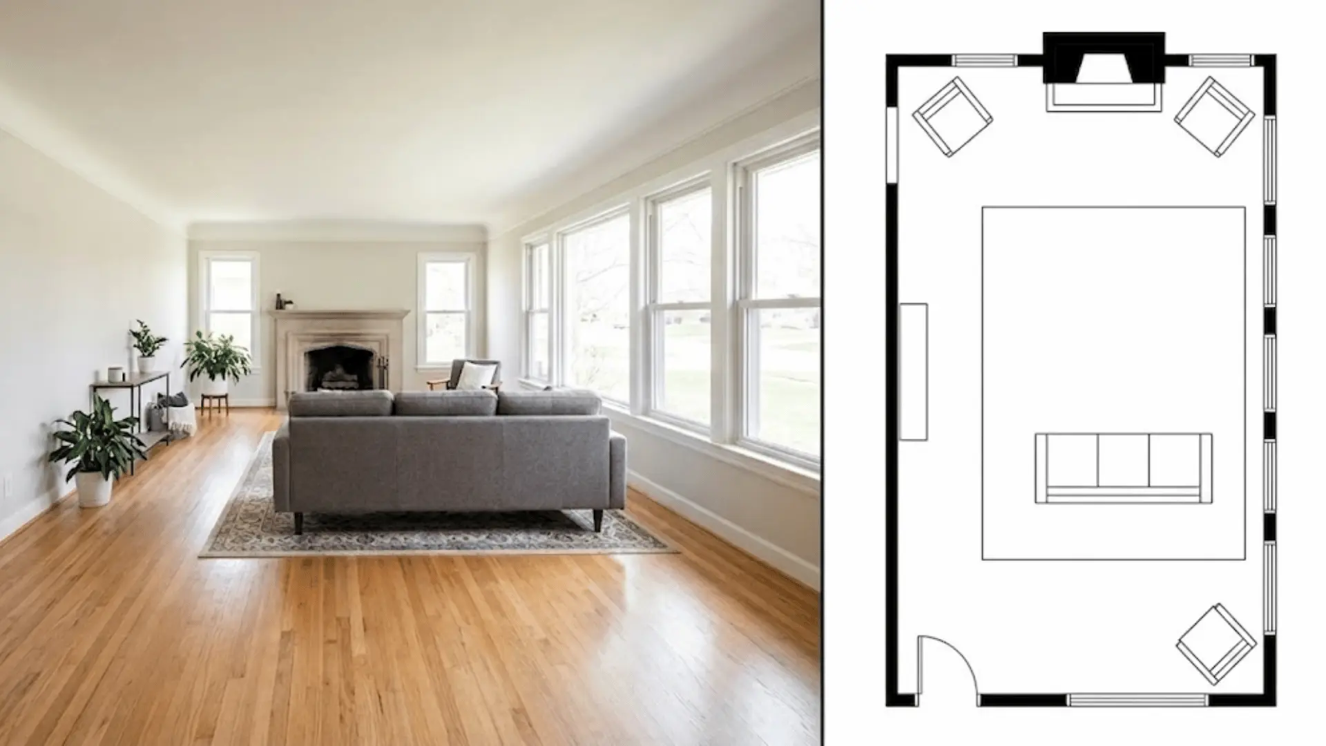
- Suitable For: Rooms where a fireplace, TV, or architectural detail already sits on the short end.
- Watch Out For: Letting foot traffic cut between the sofa and the focal point it is facing.
The sofa faces the short wall directly, with the main walkway kept along one side rather than through the seating. Orienting seating this way shortens how long the room feels instead of stretching it further.
Since the focal point already dictates where attention should go, this layout uses that instead of fighting it with an awkward sideways arrangement.
12. Two Sofas Facing Each Other
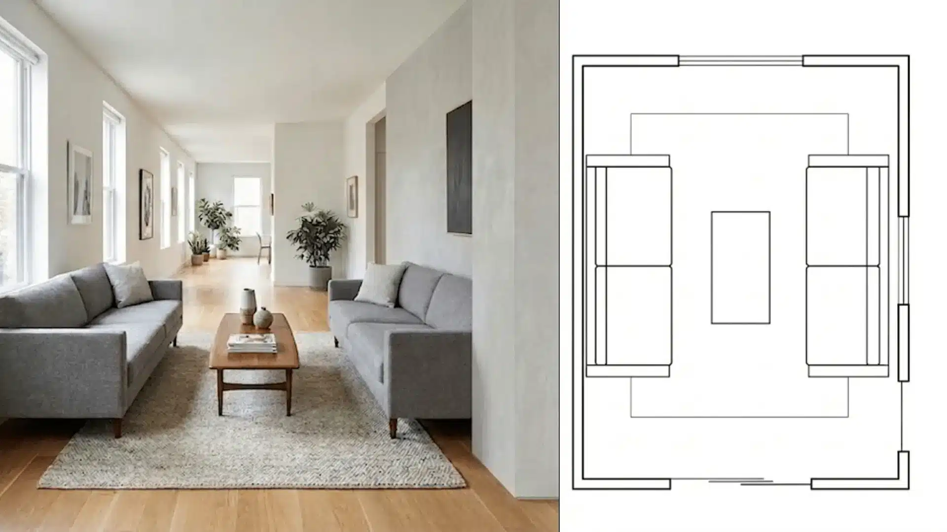
- Suitable For: Conversation-focused rooms where the TV is not the main draw.
- Watch Out For: Choosing sofas too deep for a narrow room, which can crowd the walkway.
Two sofas sit parallel, facing one another across a coffee table, centered along the room’s width. The symmetry gives the layout structure and naturally encourages people to talk face to face rather than side by side.
A slimmer sofa profile keeps this arrangement comfortable in tighter rooms, so the seating stays inviting without eating into circulation space.
13. Sofa Paired With Two Swivel Chairs
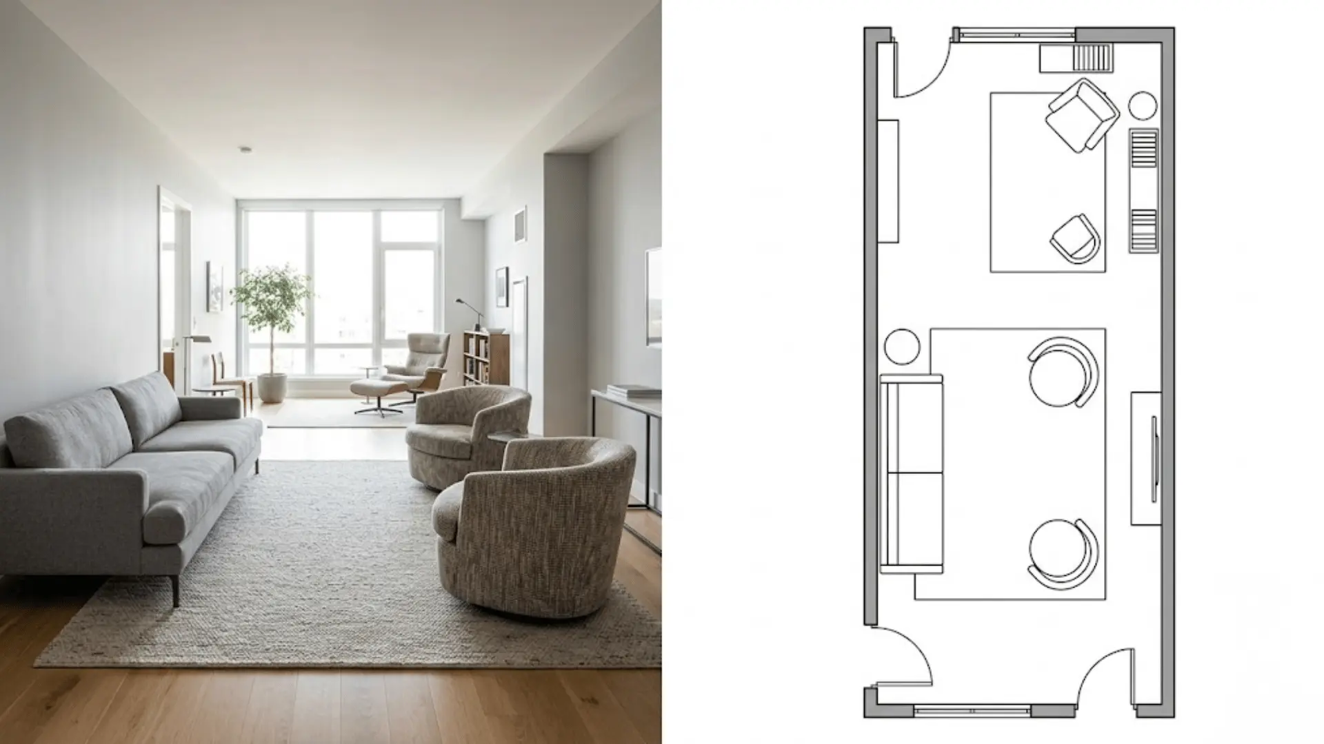
- Suitable For: Multifunctional rooms that shift focus between a TV, a window, or a conversation area.
- Watch Out For: Positioning chairs where their swing radius blocks a walkway.
The sofa handles primary seating, while two swivel chairs sit nearby and can turn toward whichever zone is active. This flexibility lets a single seating area serve more than one purpose without rearranging anything.
It is especially useful in rooms that need to adapt throughout the day, from movie nights to casual conversation.
14. L-Shaped Sectional Along the Room’s Length
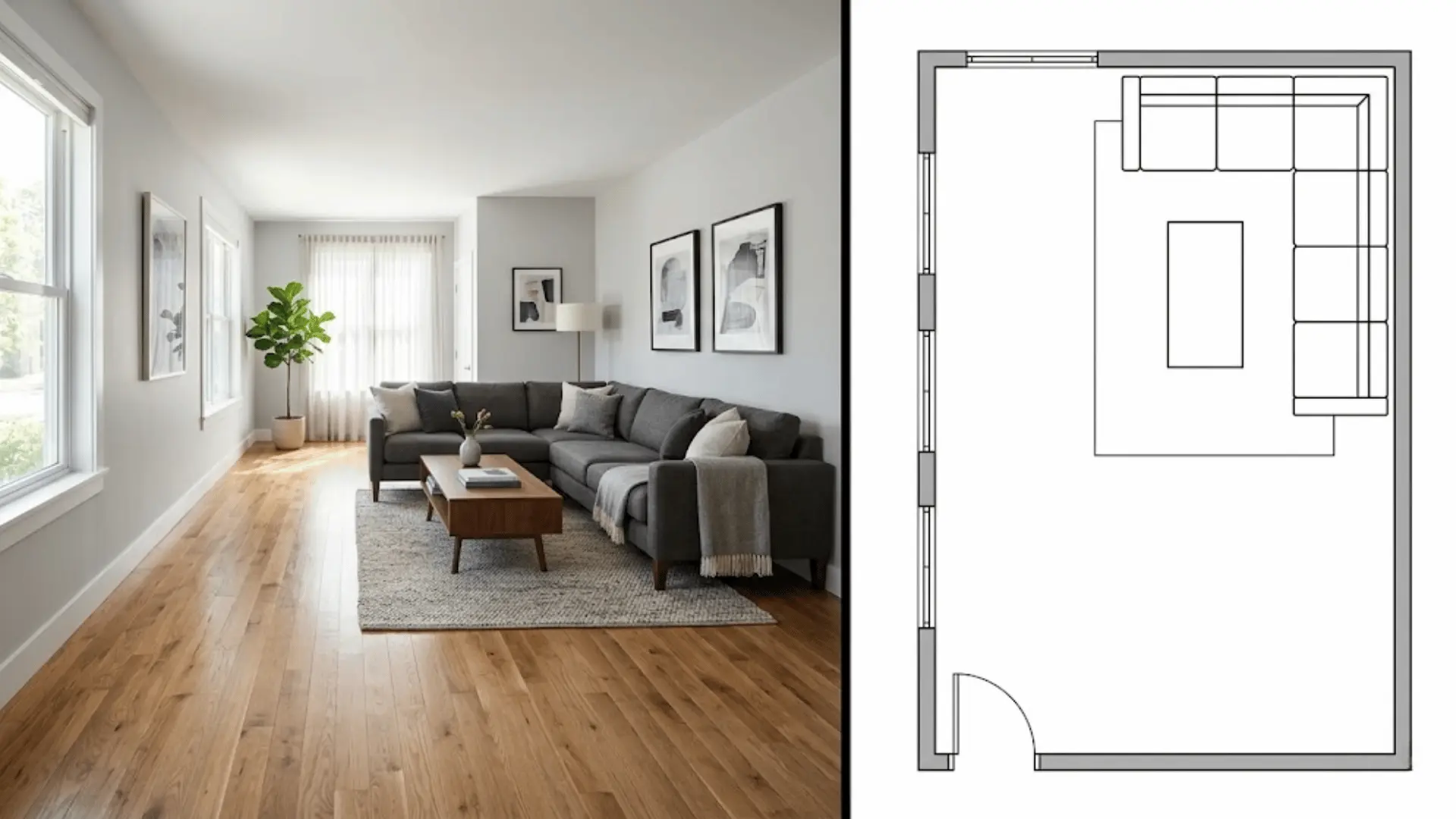
- Suitable For: Rooms with a usable corner and enough width for the sectional’s depth.
- Watch Out For: An oversized sectional that narrows the walkway meant to run beside it.
The sectional’s chaise end fills the corner, using the room’s length while creating a defined seating boundary. This maximizes seating without scattering separate pieces along both walls.
It works particularly well when the room has one natural corner that can absorb the sectional’s shape without disrupting the rest of the layout.
15. Two Loveseats Facing Inward
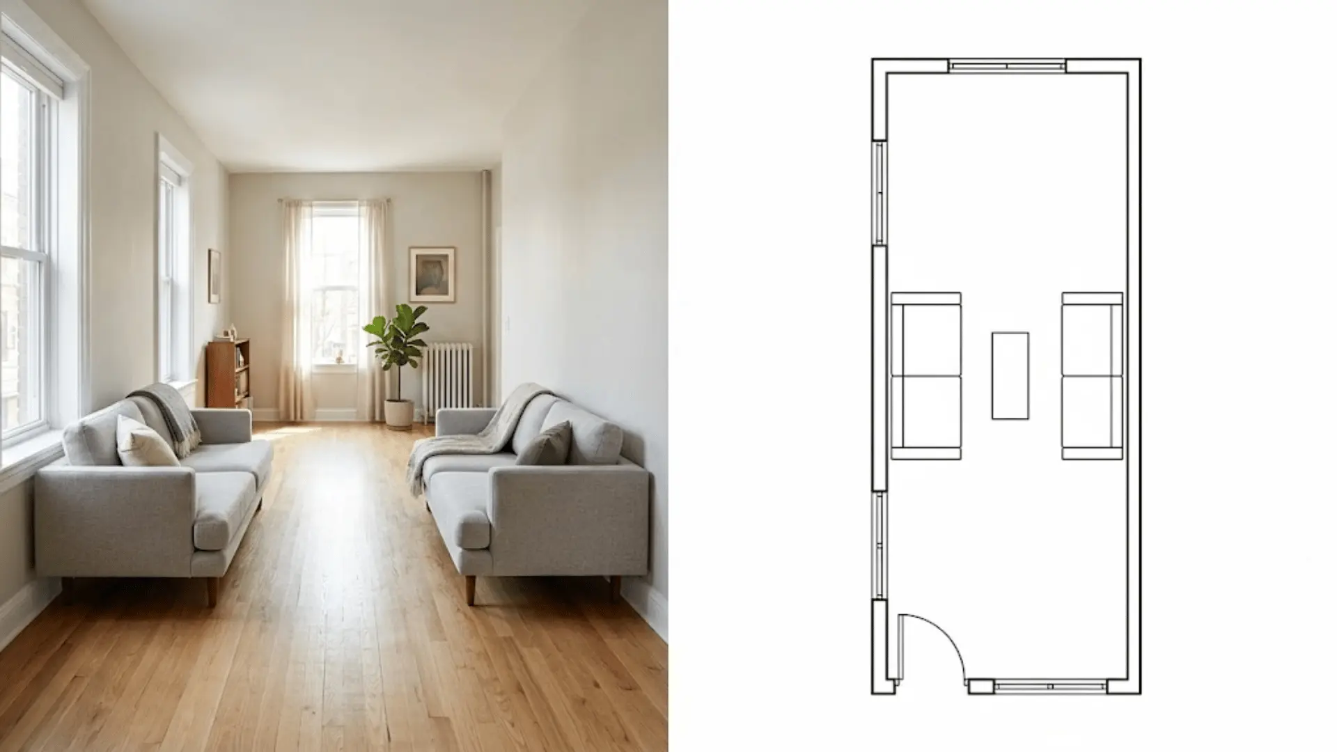
- Suitable For: Narrower rooms that need real seating without emphasizing the length further.
- Watch Out For: Spacing the loveseats too far apart, which makes the seating area feel disconnected.
Two loveseats face each other or the room’s center, positioned across the width instead of along it. Crosswise placement interrupts the eye’s pull toward the far end of the room.
This arrangement suits rooms too narrow for a full sectional but still in need of proper seating for two separate groups.
Multi-Zone Layouts for Rooms That Serve More Than a Purpose
When one seating area cannot fill the space, splitting the room into zones puts the extra length to work.
16. Main Seating Plus a Reading Nook
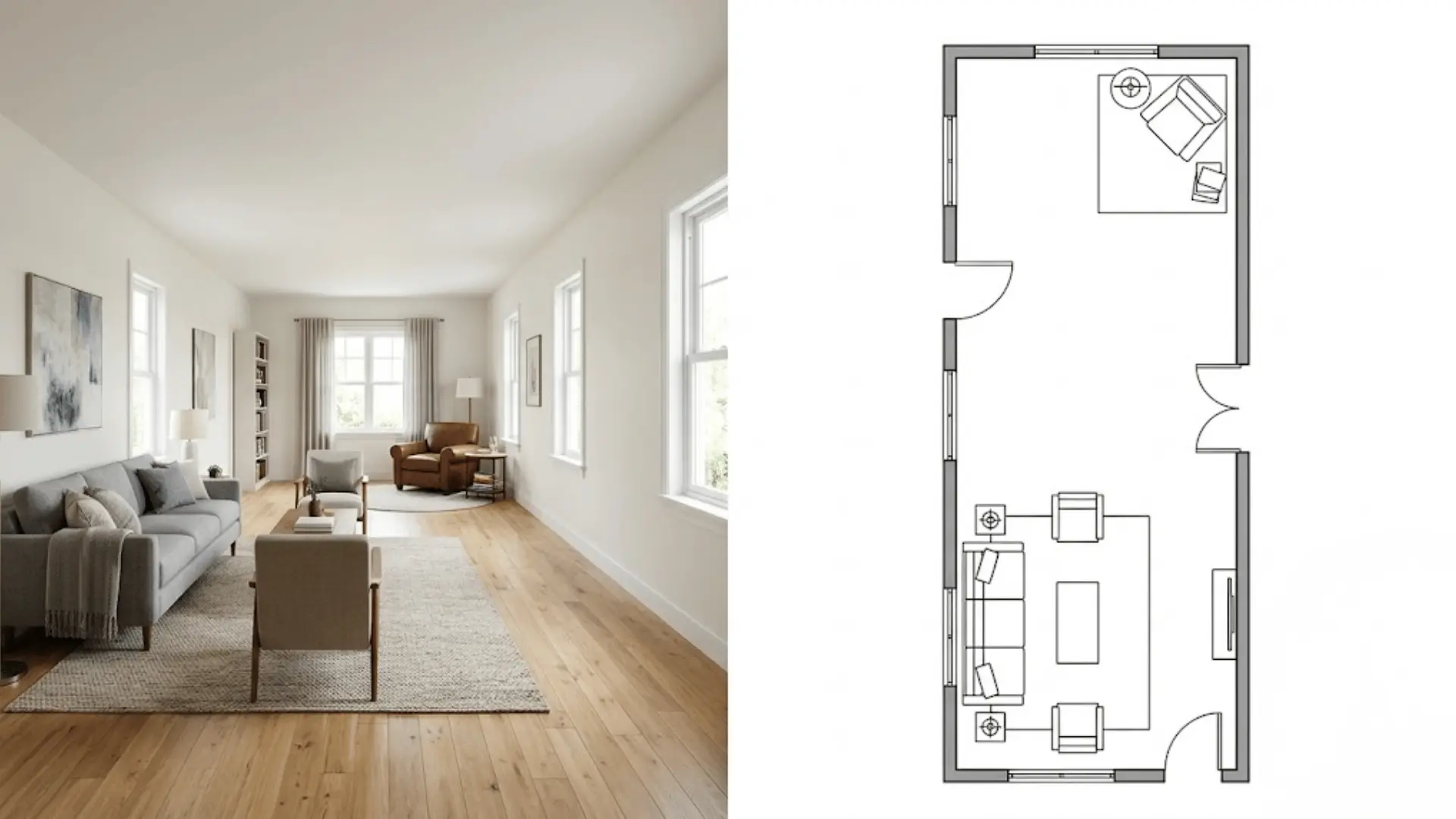
- Suitable For: Rooms with enough length to support a second, smaller destination.
- Watch Out For: Placing the nook too close to the main seating, which blurs the two areas together.
The main seating group sits at one end, with two chairs and a small table anchoring a reading nook at the other. This gives the far end of the room a reason to exist instead of sitting empty.
Keeping distance between the two areas helps each one feel like its own dedicated space rather than an extension of the other.
17. Living Area Combined With a Home Office
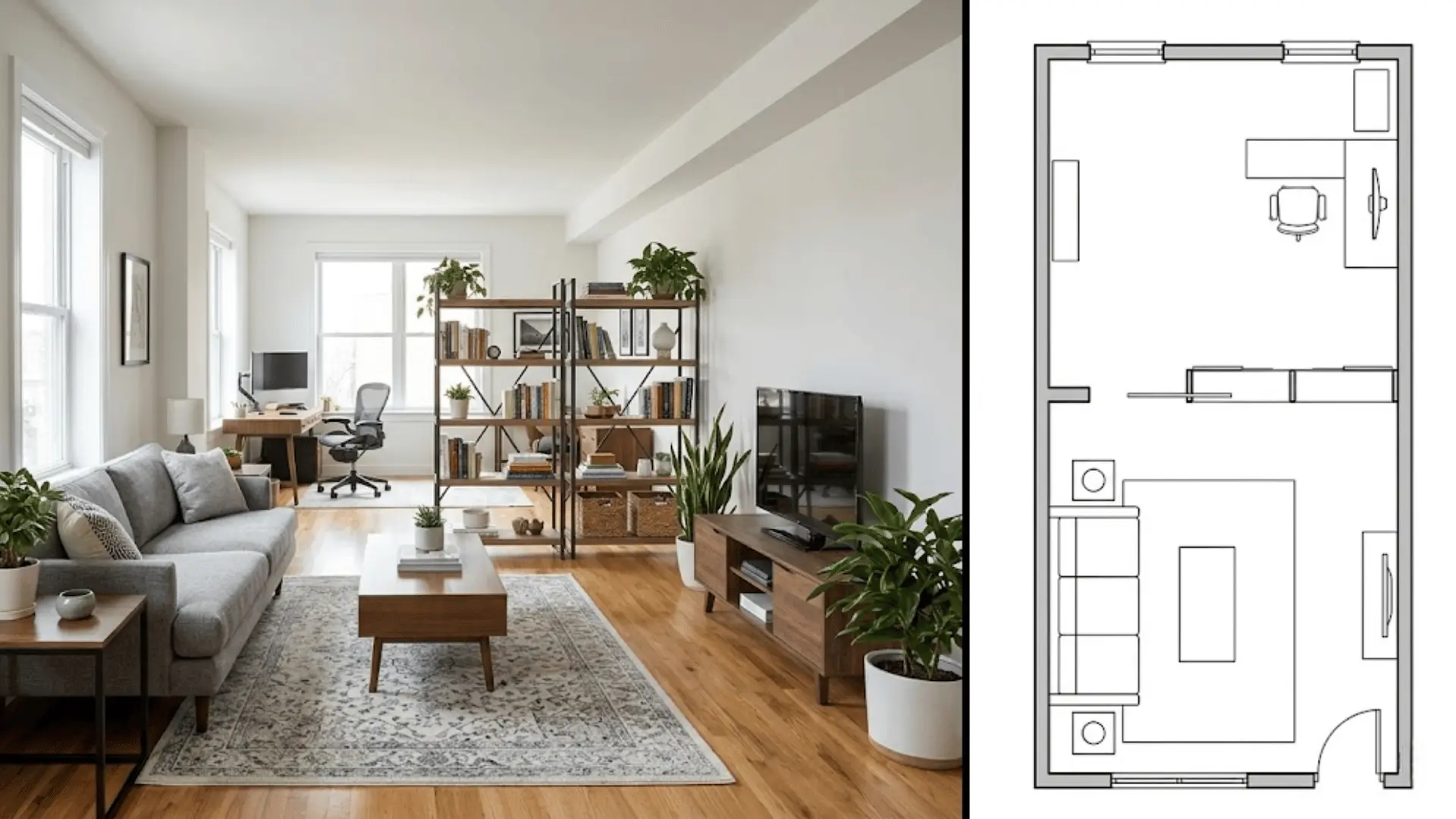
- Suitable For: Households where one room needs to double as a workspace.
- Watch Out For: Positioning the desk directly in the sightline from the main seating.
The living area keeps the sofa and coffee table, while a desk occupies the less central end, separated by a console, rug, or open shelving. A visual divider signals the shift from relaxing to working without adding a wall.
Getting this right often comes down to the same principles behind designing a functional home office, where visual separation matters as much as square footage.
This setup suits homes where a dedicated office is not available but focus still matters during work hours.
18. Living Area Combined With a Game Table
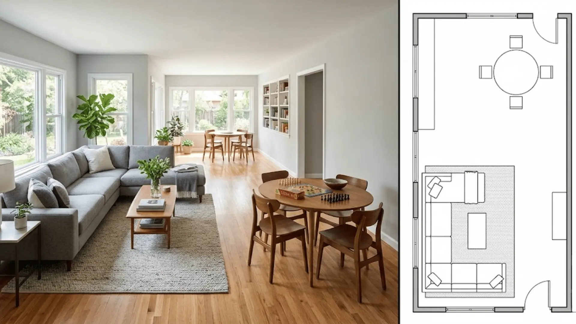
- Suitable For: Family rooms that need a spot for cards, puzzles, or board games.
- Watch Out For: A table too large for the leftover space, which narrows the walkway.
Main seating occupies one section, while a compact game table fills the remaining length. This gives the room a second function without crowding the seating area.
It is a practical option for families who want a casual activity spot without converting part of the living room into a full second room.
19. Living Room Paired With a Small Dining Area
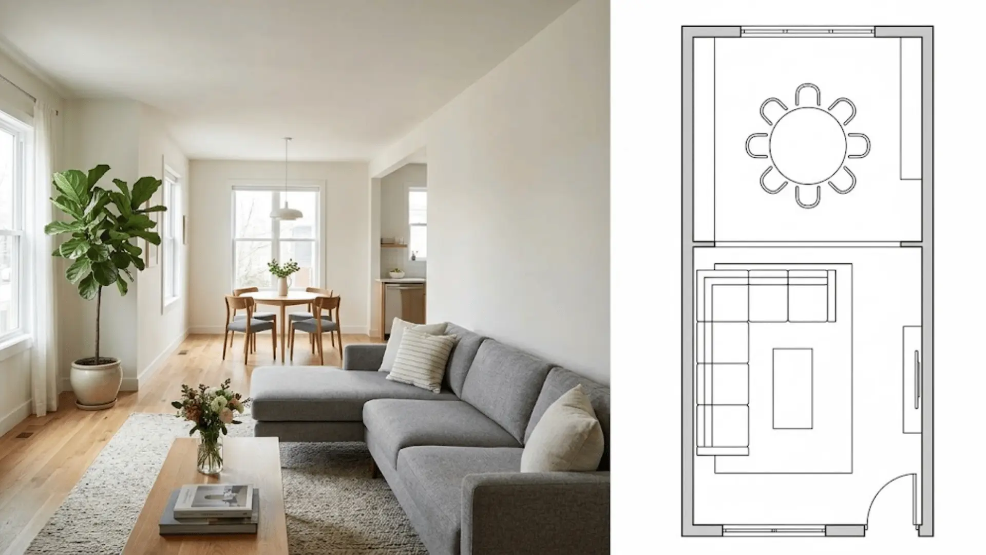
- Suitable For: Open-concept spaces where living and dining share one long footprint.
- Watch Out For: Dining chairs pulled out far enough to block the main walkway.
The back of the sofa, a console, or a rug marks the boundary between the two zones. Clear zoning keeps an open floor plan from reading as one undefined stretch of room.
This layout works well in homes where a separate dining room is not part of the floor plan, but mealtime still needs its own defined space.
20. Separate Conversation Zone and TV Zone
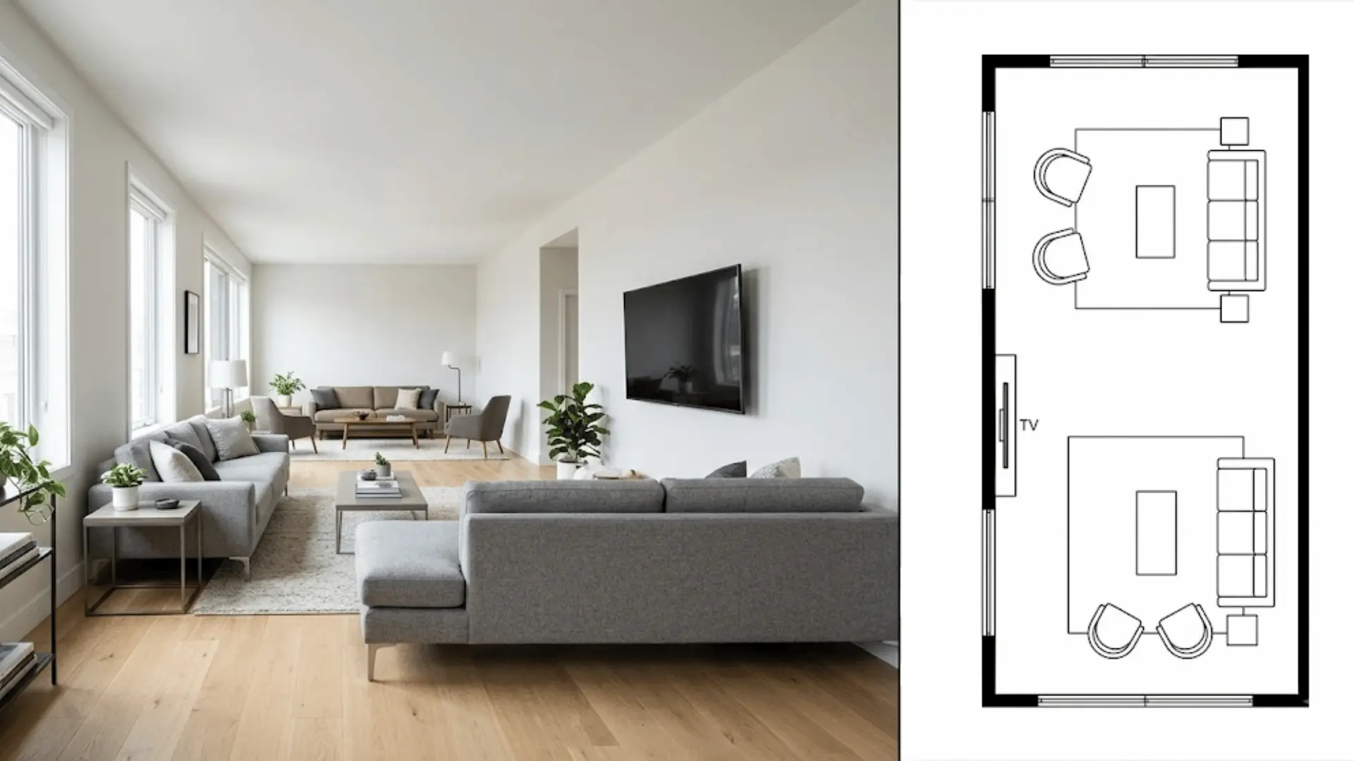
- Suitable For: Larger long rooms where a single TV-facing layout leaves part of the space unused.
- Watch Out For: Letting the two zones overlap so neither one feels distinct.
One seating group faces the screen, while a second group faces inward, dedicated to conversation. This uses the room’s full length instead of orienting everything in one direction.
It suits households where some family members want to watch TV while others prefer to talk, without either group feeling like an afterthought.
21. Two Seating Zones Split by a Central Walkway
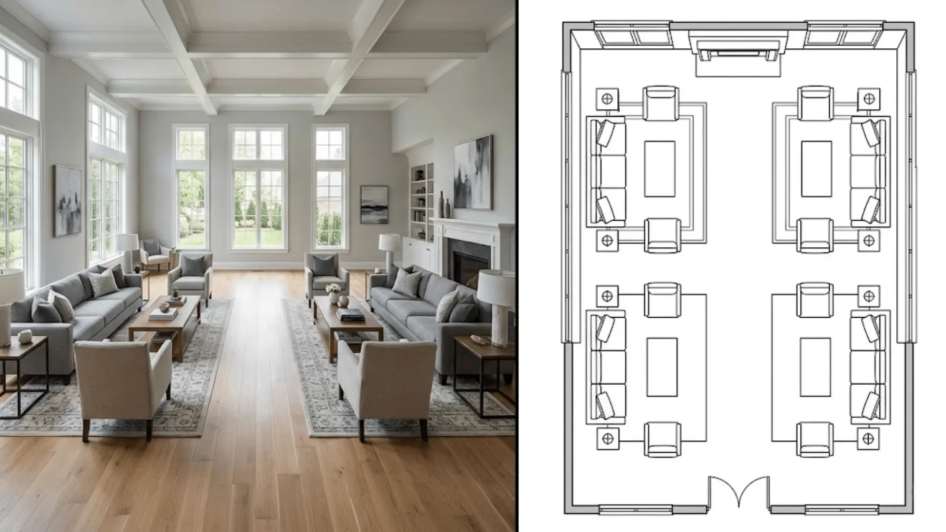
- Suitable For: Very long, wide rooms that can support seating on both sides.
- Watch Out For: Trying this in a genuinely narrow room, where the walkway will crowd both seating areas.
A seating group sits on each side of a defined central path running the length of the room. This uses the full footprint while keeping circulation clear and intentional.
It only works when the room has enough width to spare, since a narrow layout would leave neither seating group with breathing room.
Layouts for Rooms With Limited Wall Space
Fewer usable walls means furniture has to work harder. These layouts keep circulation clear even when perimeter space runs short.
22. Floating Sofa With Circulation Behind It
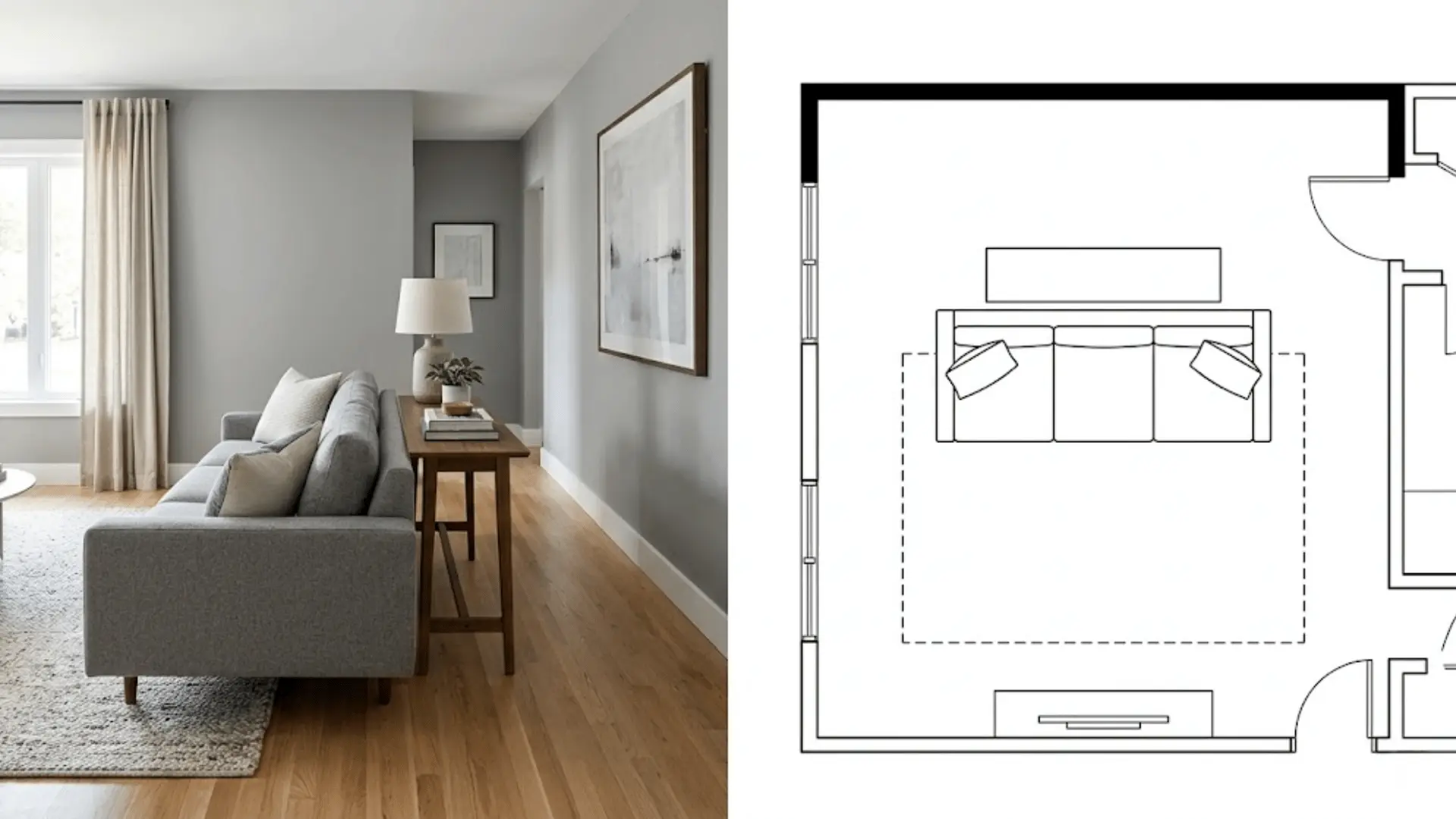
- Suitable For: Rooms that function as both a living space and a passageway.
- Watch Out For: Leaving too little clearance behind the sofa for comfortable passage.
The sofa sits away from the wall, with open circulation running behind it and a console table finishing off its back. This keeps the seating area intact while preserving a clear route through the room.
It suits rooms where walls are already claimed by doors or windows, leaving no other option but to float furniture toward the center.
23. Sofa Positioned Perpendicular to the Long Wall
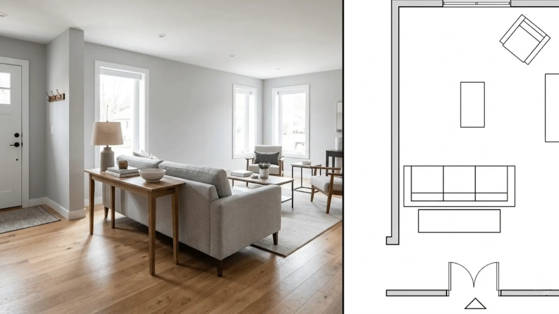
- Suitable For: Rooms near an entry that need a natural break between arrival space and living space.
- Watch Out For: Positioning the sofa where it blocks the door’s swing.
The sofa sits perpendicular to the long wall, with its back oriented toward the entry to establish a boundary. This signals a shift from entryway to living area without adding a physical wall.
The same logic shows up in modern entryway design ideas, where a single furniture piece often does the job a wall would otherwise do.
It is a useful trick when the front door opens directly into the living room and some separation feels necessary.
24. Corner Sectional With an Open Side Walkway
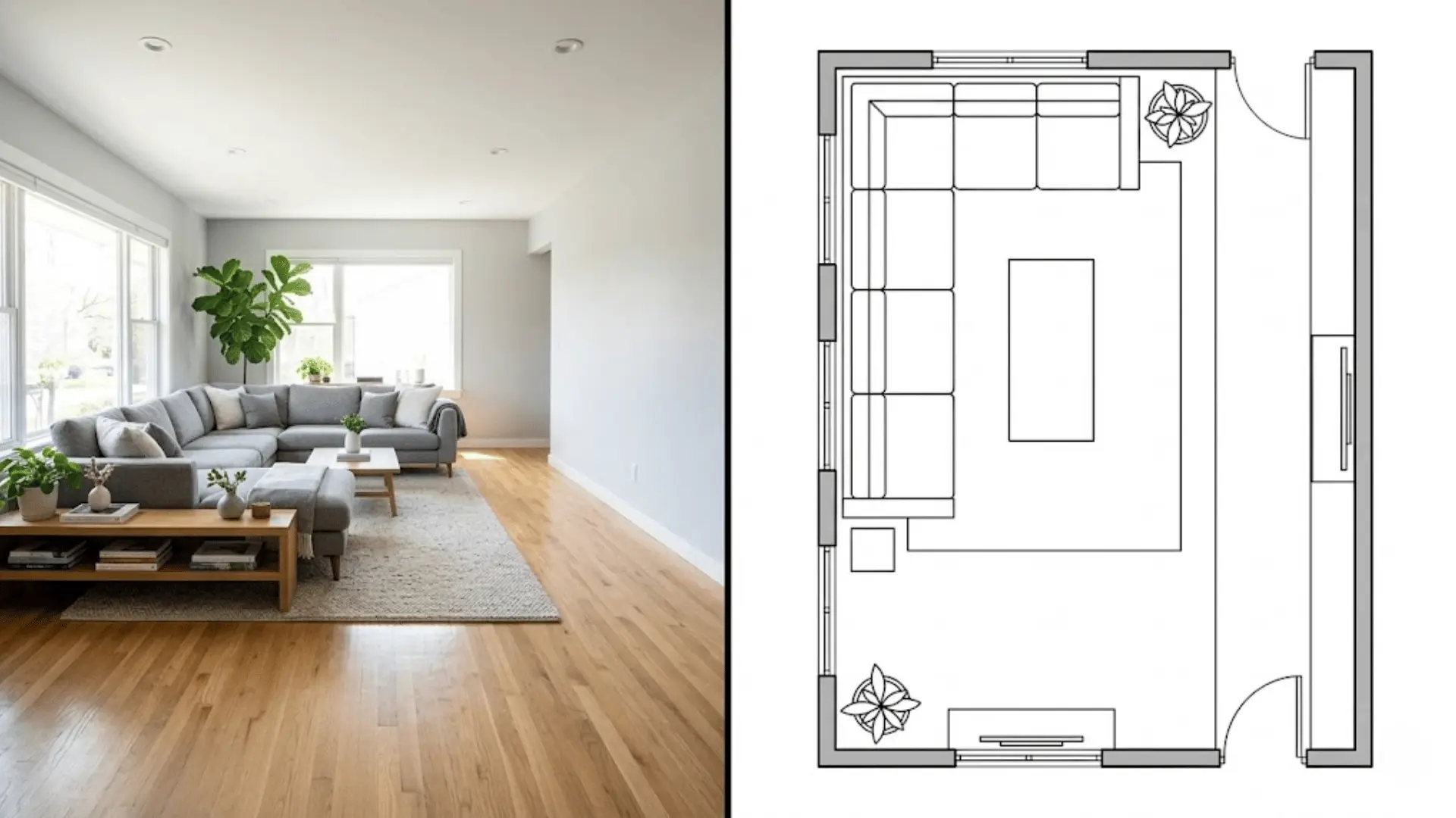
- Suitable For: Rooms that need generous seating without sacrificing circulation.
- Watch Out For: A sectional deep enough to narrow the remaining path uncomfortably.
The sectional hugs two walls, leaving one side of the room fully open as a walkway. This maximizes seating capacity while keeping the middle of the room usable.
It works well in rooms with limited wall space overall, since the sectional consolidates seating into one corner instead of spreading it out.
25. A Centered Furniture Cluster
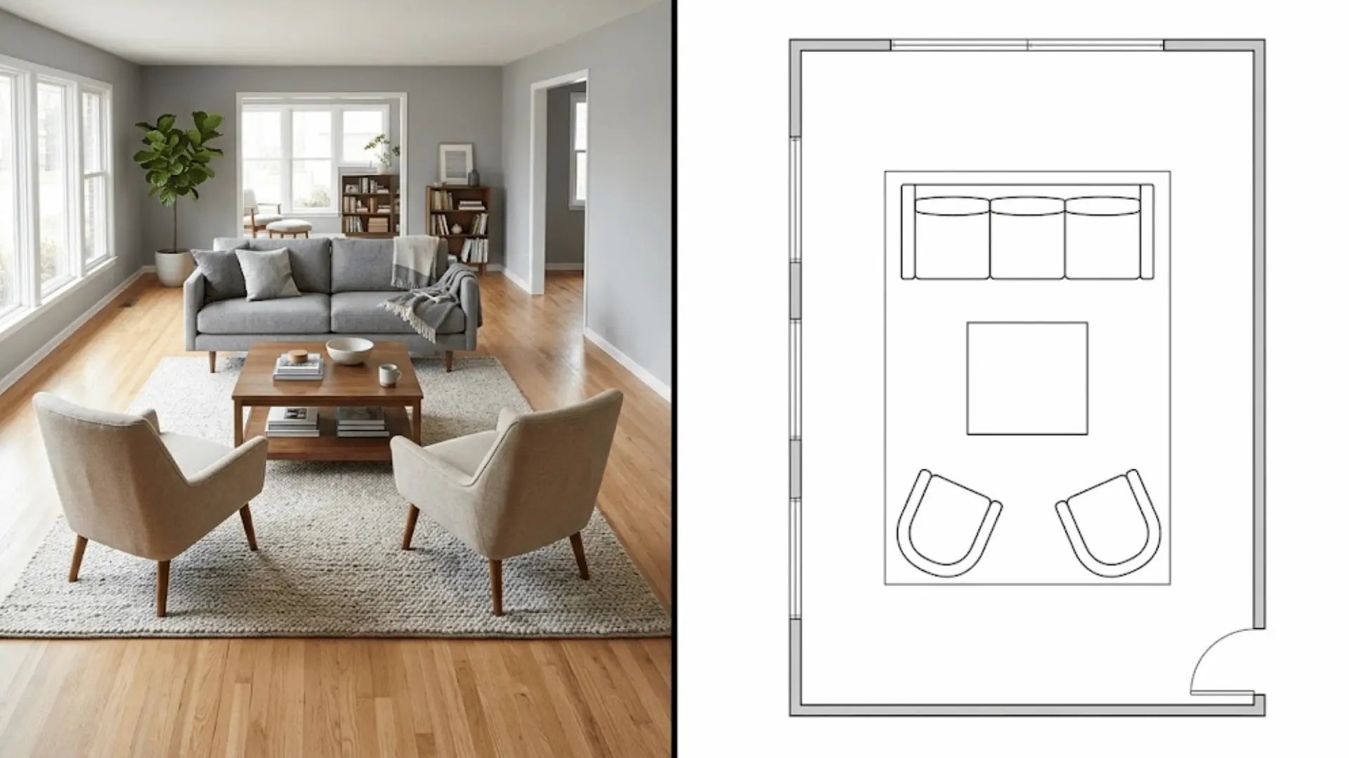
- Suitable For: Rooms where doors, windows, or radiators make perimeter placement awkward.
- Watch Out For: Centering furniture without leaving enough clearance for people to walk around it.
Furniture forms one intentional grouping near the room’s center, with breathing room left on all sides. This works around the room’s architecture instead of fighting it, creating a deliberate focal arrangement.
It is especially helpful in older homes where radiators, vents, or oddly placed windows limit where furniture can realistically go.
26. Long Sofa With a Slim Console and Accent Chairs at the End
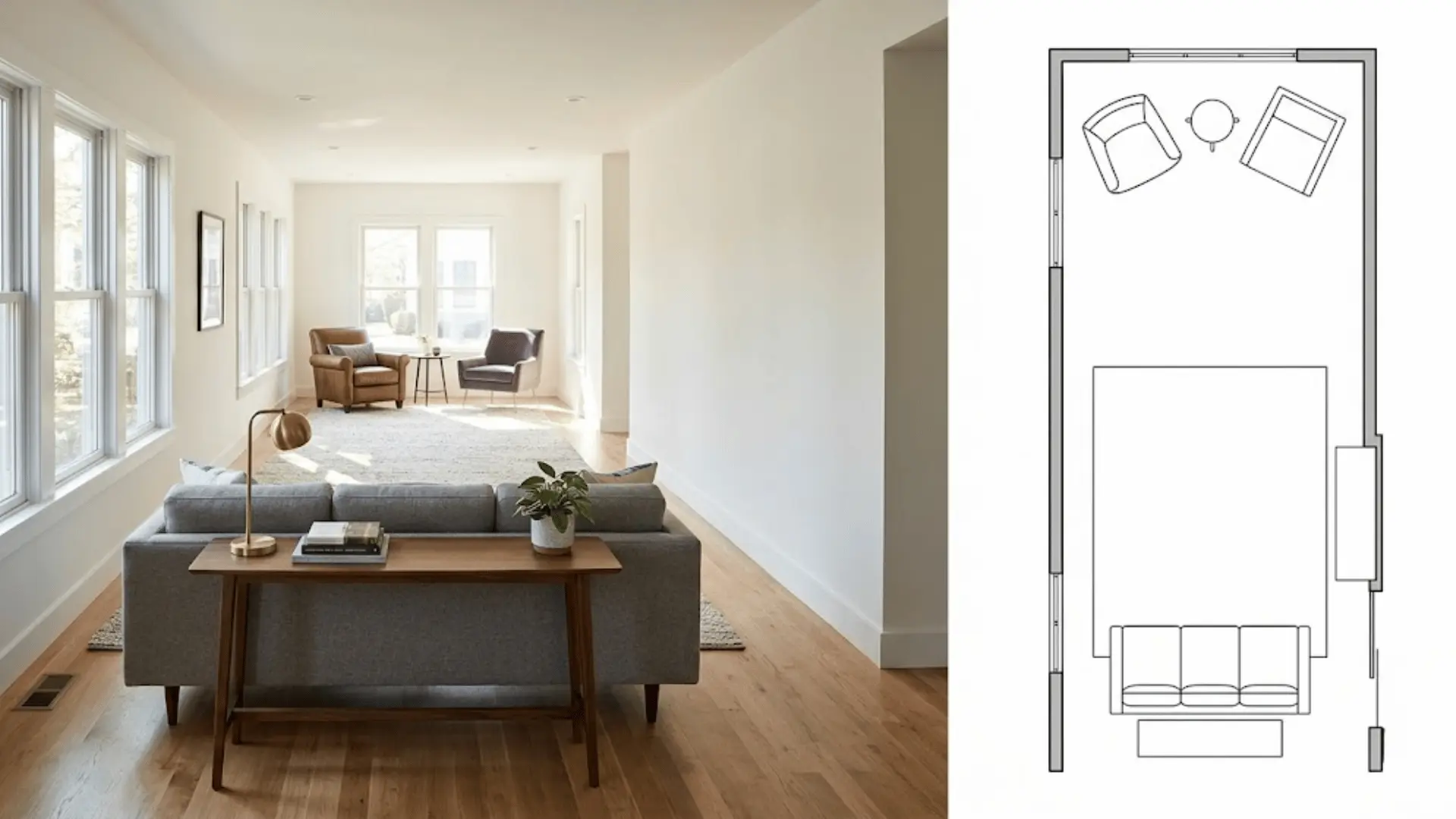
- Suitable For: Rooms with an empty far end that needs a visual destination.
- Watch Out For: A console deep enough to interfere with the walkway behind the sofa.
The main sofa anchors primary seating, a narrow console fills the rear, and accent chairs sit at the opposite end. This gives the far end of the room a purpose instead of leaving it bare.
It is a simple way to stretch a single seating arrangement across a longer room without adding a whole second zone.
27. Furniture Kept to One Side for a True Pass-Through Room
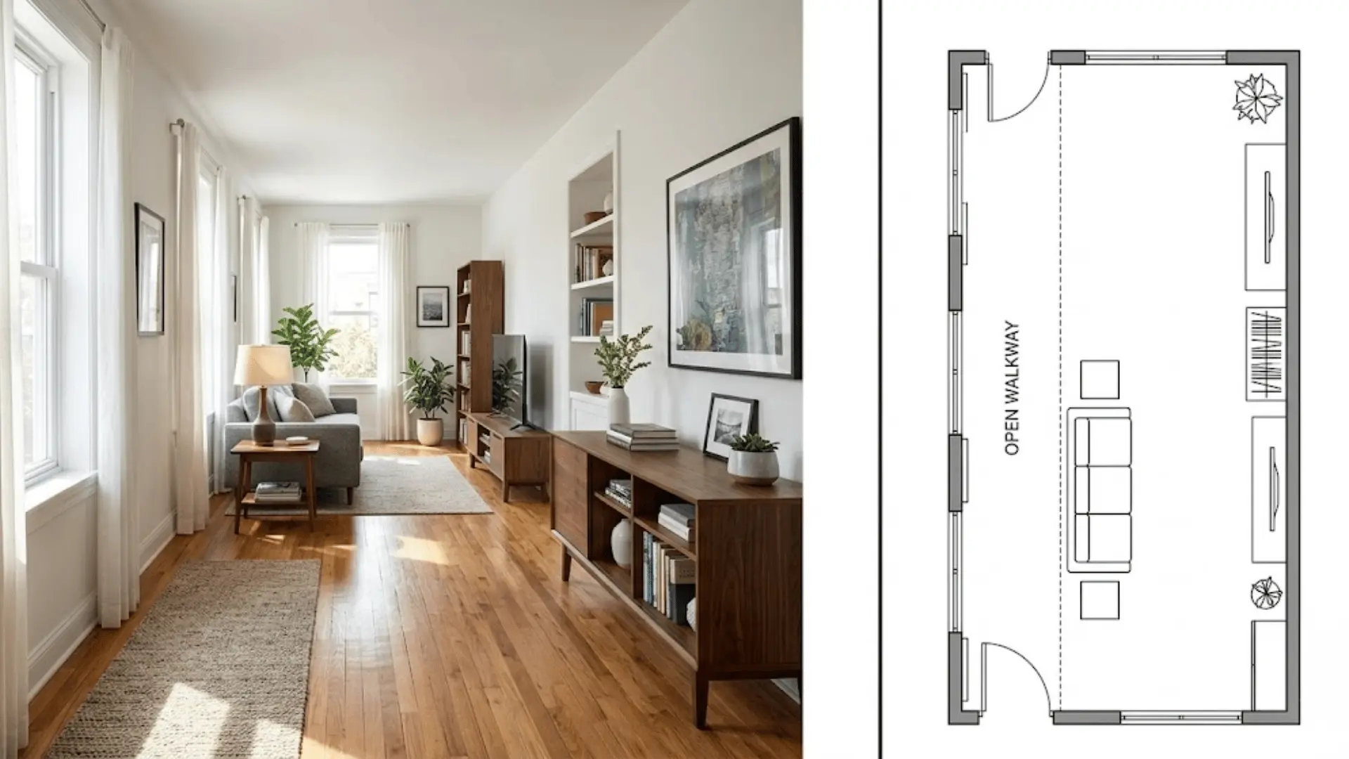
- Suitable For: Rooms so narrow that floating furniture would block circulation entirely.
- Watch Out For: Furniture deep enough to eat into the one path the room can spare.
All furniture sits along one side, leaving a single uninterrupted pathway on the opposite side. This preserves circulation in rooms too tight for any other configuration.
Wall art, lighting, and a rug add visual interest to the arrangement without taking up floor space, keeping the room from feeling stripped down despite the constraints.
How to Make a Long Living Room Feel Wider?
Length is not really the enemy here; it is the eye running straight down the room without stopping. These small shifts break up that sightline and make the room feel more square.
- Arrange one or two pieces crosswise so the eye has to stop and take in the width, not just the length.
- Let furniture with visible legs sit above the floor instead of blocking it, since visible floor space reads as room to spare.
- Size rugs to each seating area rather than one long runner, which only reinforces the room’s shape.
- Angle a mirror to catch light from a window, doubling how open the space feels without adding a single inch.
- Give each short end something to look at, like art or a plant, so the room stops feeling like it is pointing toward an exit.
- Layer a floor lamp or wall sconces alongside the ceiling fixture, since one light source in a long room tends to leave the ends looking dim and forgotten.
- Hang curtains close to the ceiling instead of the window frame, pulling the eye up and taking some attention off the room’s length.
None of this requires new furniture or a renovation. It is mostly about redirecting where the eye lands first, and once that shifts, the room stops feeling like a hallway and starts feeling like a room worth sitting in.
The Bottom Line
A long living room stops feeling like a hallway the moment traffic flow, scale, and zoning start doing their job.
None of the layouts here need a renovation, just thoughtful placement based on your doorways, windows, and how your space actually gets used day to day.
Designers return to these same principles again and again because they work across almost any long living room layout, whether the room is wide, narrow, or somewhere in between.
Try one that fits your space, and let it feel like yours.
Which layout matches your living room best? Share it in the comments, I’d love to hear.
Frequently Asked Questions (FAQs)
How Do You Break up a Long Living Room?
Split the room into functional zones using rugs, furniture placement, and lighting instead of leaving one long stretch of space. A console table or the back of a sofa can also mark where one zone ends and the next begins.
What Furniture Works Best in a Long Narrow Living Room?
Slim-depth sofas, swivel chairs, loveseats, and appropriately scaled sectionals all work well without crowding the walkway. Narrow storage pieces add function without eating into the room’s width.
Should a Sectional Go in a Long Narrow Living Room?
An L-shaped sectional works well when there’s a usable corner and enough width to fit its depth. It becomes too bulky when it narrows the walkway or overwhelms the room’s proportions.
How Wide Should a Walkway Be in a Living Room?
A primary walkway generally needs around 30 to 36 inches of clearance where the room allows for it. Real-world layouts vary based on doorways, furniture size, and how tight the space actually is.
How Do You Arrange a Long Living Room without Making It Look Like a Hallway?
The key is interrupting the long, uninterrupted sightline instead of letting furniture line both walls. Creating intentional zones with rugs, lighting, and crosswise furniture placement breaks up that hallway feeling.