White walls have long been popular in bedrooms, but now entire bedrooms are embracing a single color.
A color-drenched bedroom looks bold in pictures, but in real life, it actually feels soft and cozy, almost like the room is hugging you. The difference between bold and soft looks comes down to a few smart choices.
The color you choose matters, of course, but so do how you prep, paint, light, and style the space.
I’ll walk you through each step, share favorite room ideas, and point out the common mistakes that can ruin the effect.
What is Color Drenching in Interior Design?
Color drenching is a design technique in which you paint the walls, ceiling, trim, doors, and moldings the same color. In a bedroom, this lowers the contrast between surfaces and creates a cozy, calm feeling.
To keep the room from looking too flat, try using lighter or darker shades for bedding and curtains.
Why Does Color Drenching Work so Well in Bedrooms?
Bedrooms are usually used in low light, so painting the whole room one color creates a soft, calm look rather than a busy background. When you’re lying in bed, you often look at the ceiling.
If you paint it the same color as the walls, it blends in and feels like part of the space, not just a blank surface.
Painting the trim and doors the same color keeps them from standing out, making the room feel more peaceful.
This approach works especially well in small bedrooms. When the corners and edges are all the same shade, the walls seem to fade back, so even a small room feels thoughtfully designed instead of crowded.
The space looks complete even before you add any decorations.
Step-by-Step Process to Create a Color Drenching Bedroom
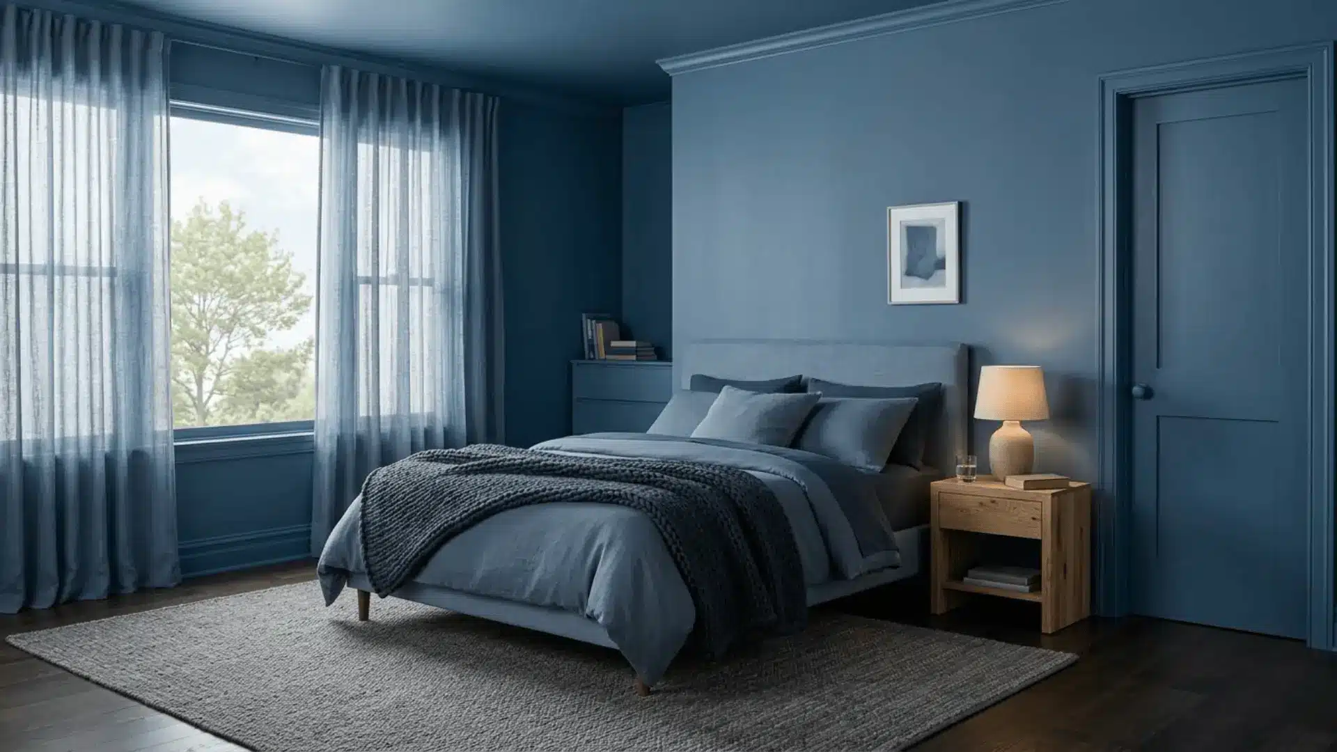
Color drenching looks effortless when done well, but every well-executed space has a quiet intention behind it.
Here is how to build yours from the ground up.
Step 1: Choose a Color by Mood
I always begin by thinking about the mood I want in the room, because paint color affects both how it feels and how spacious it looks.
Soft sage or dusty rose creates a calm vibe. Deep navy or forest green adds drama. Warm taupe gives a grounded, earthy feel. I choose colors based on things I already love, like linen bedding or a wooden nightstand, so everything ties together.
Step 2: Test Samples and Pick a Sheen
Paint large sample patches on two different walls before making your final choice.
Look at them in the morning and again at night with your own lights.
Paint often looks different at home than it did in the store, so this step can help you avoid repainting later. Also, decide on the finish now. Using the same sheen throughout makes cleaning easier.
If you’re choosing between flat and satin paint for trim, consider how much you’ll touch it.
Check for Lead and Plan Airflow
Check old trim for lead before sanding or scraping. Older homes might have lead-based paint.
Before you start painting, make sure you have good airflow. Open the windows and use a fan while you paint and as the room dries. Paint releases VOCs, so the EPA recommends extra ventilation whenever you use these products.
Step 3: Prep Every Surface
Move your furniture to the center of the room and cover it. Wipe down all surfaces so the paint sticks well.
Fill any nail holes and sand them smooth. Use caulk to seal gaps between the trim and walls, because cracks will stand out once everything is painted. Prime over stains, patched spots, and any glossy woodwork.
Use tape only where the paint meets the floor or another room.
You don’t need perfect lines between surfaces inside the room.
Step 4: Paint From the Top Down
Work from the top down so drips get covered as you go:
Ceiling first | Walls next | Trim, doors, and moldings last, using a fine brush for the detail
Give each coat its full drying time before the next one goes on. Roll walls in sections and keep a wet edge, so lap marks don’t show. Finish a whole wall before you stop for the day.
Step 5: Layer Textures and Tones
Using just one flat color everywhere can make a room feel stark. Try layering tones instead.
Combine materials like velvet, linen, raw wood, and matte metal. These reflect light differently and make the space feel more interesting. If the paint still seems flat, pick a shade lighter or darker from the same color card for the ceiling or trim.
The room will still look unified, but with added depth.
Step 6: Light It Warmly
Lighting can really change the feel of a room. Warm-toned bulbs help highlight earthy and jewel-toned colors.
Check the box for bulbs labeled 2200 to 3000K, the range recommended for a cozy, yellowish glow similar to incandescent bulbs. Try mixing bedside lamps, recessed lights, and even candles.
The more light sources you have, the softer the shadows will be.
This way, your colors look good all day, not just when the sun is out.
Step 7: Keep Contrast Minimal
Color drenching works best when everything feels cohesive. Bold, contrasting accents can ruin the look.
I like to keep the decor in the same color family and make sure it feels intentional.
Try to match your wall art and frames to the wall color, too. Even a small amount of contrast can have a big impact, so use it thoughtfully, maybe with a single sculptural piece or something natural like rattan or stone.
This way, you add interest without losing the overall effect.
Best Colors for a Color Drenching Bedroom
Picking the right color really makes a big difference. The shade you choose sets the mood for the whole room.
Here’s a quick guide to some favorite palettes and what they can add to your space. These shades are a reliable place to start your sample board. Brands update their ranges, so check each color page before you buy.
|
Paint Color |
Palette |
Pair It With |
|---|---|---|
|
Deep blues and navy |
Brass accents, cream linen |
|
|
Earthy greens |
Raw wood, terracotta |
|
|
Warm neutrals |
Jute, ivory, matte stone |
|
|
Charcoal and black |
Chrome, smoked glass |
|
|
Soft pastels |
White oak, sheer fabrics |
|
|
Warm statement hues |
Natural wood, linen |
Color Drenching Bedroom Ideas and Inspirations
Sometimes you just need to see an idea fully lived out before it clicks.
These few directions span a range of moods and personalities, so choose the one that feels most like you.
1. Moody Dark Bedroom Look
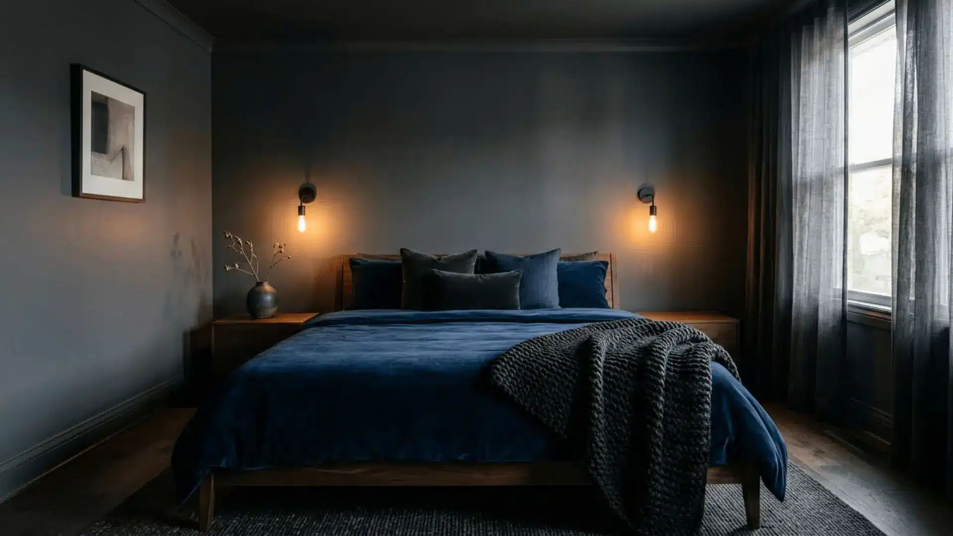
If you love bedrooms that feel like a true getaway, this one is for you.
Cover every surface in charcoal or navy and let those deep colors set the mood. Add matte black hardware, dark velvet cushions, and soft, low lighting to make the space even more dramatic. The result is a moody atmosphere that feels inviting.
Tip: Plan the lighting before painting, since darkshades need layered light to avoid feeling heavy.
2. Light and Airy Neutral Bedroom
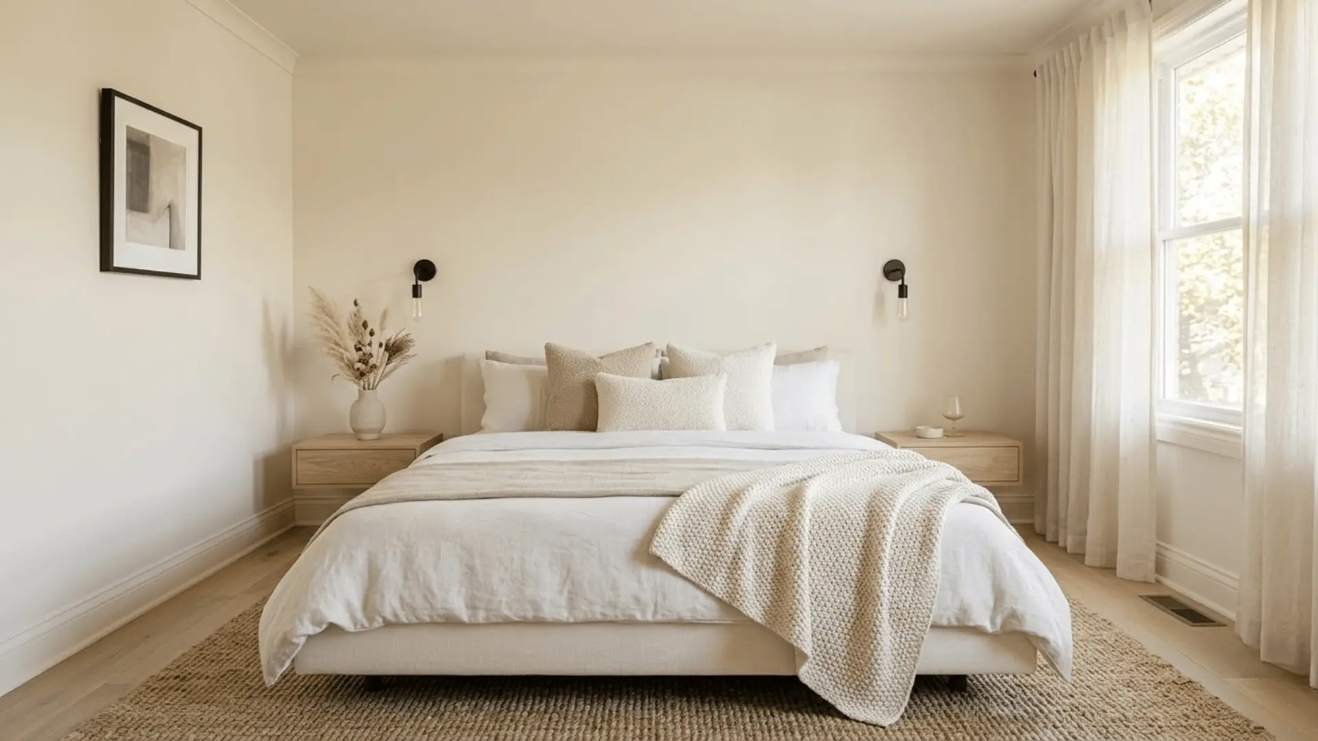
This is color drenching at its most understated. Warm whites and creams wrap the walls, ceiling, and trim, creating a luminous, cloud-like quality that feels endlessly calm.
The trick is keeping textures varied, with bouclé, linen, and sheer curtains, so the room stays visually interesting without ever feeling busy or overdone.
3. Monochromatic Green Sanctuary
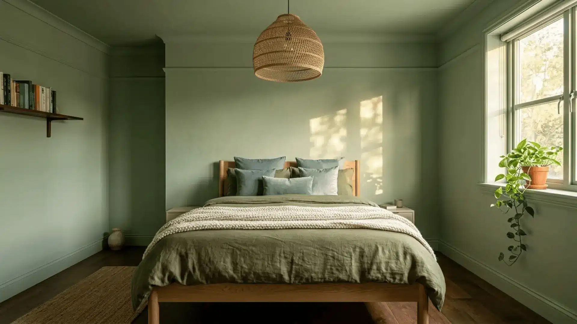
Soft, earthy greens are some of the easiest colors to live with.
If you use sage on the walls and deeper olive shades in your soft furnishings, you’ll get a rich, thoughtful look. Add natural wood and woven textures, and your room will start to feel like a real retreat.
4. Bold Statement Bedroom
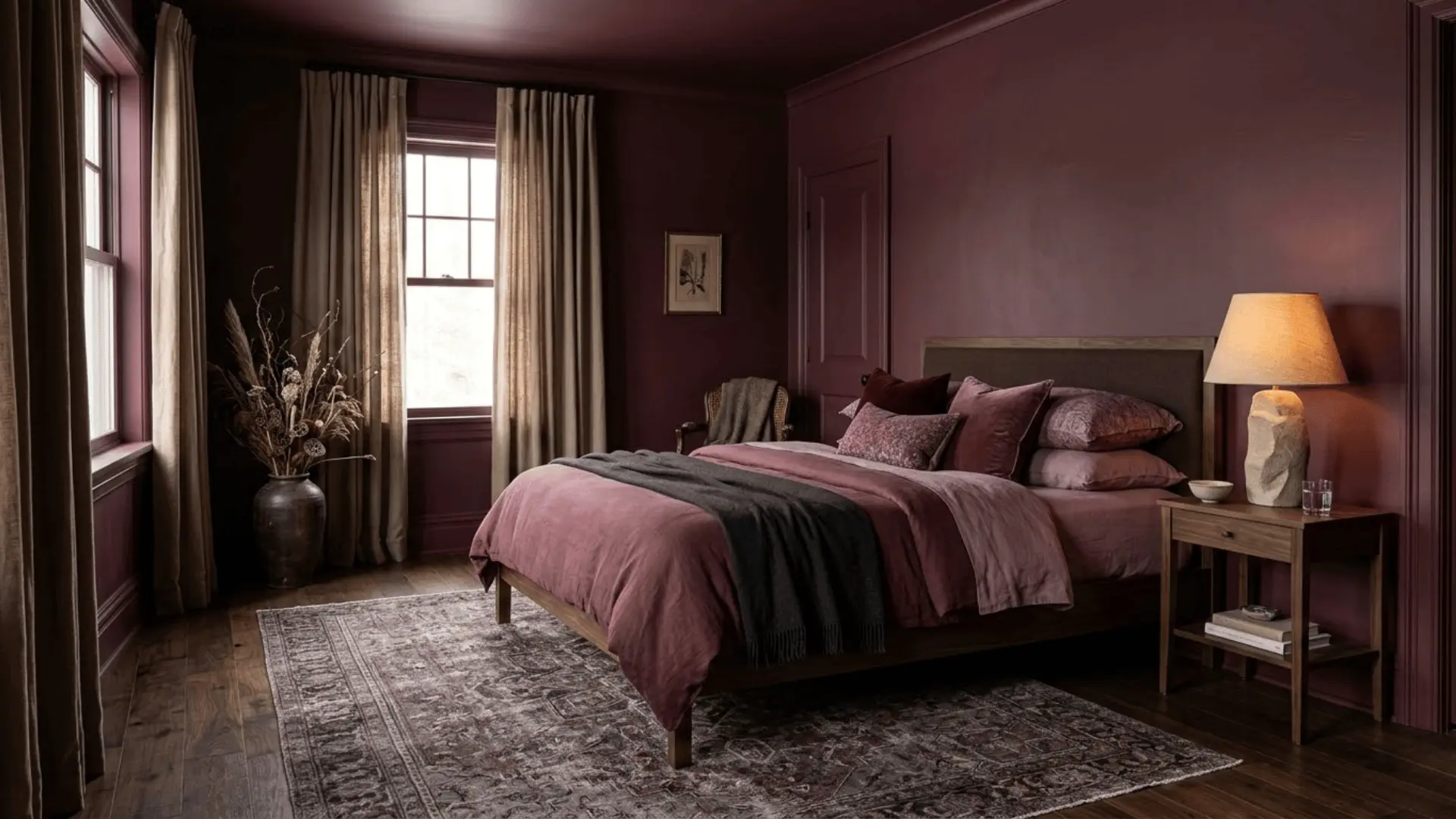
If you want your bedroom to stand out, try using rich, warm colors like terracotta and burgundy. These shades can give your space a bold, gallery-inspired feel. Deep plum creates a romantic, stylish look.
Pair any of these colors with natural materials and simple decor so the color stands out as the main feature.
Tip: Choose muted, earthy versionsover bright, intense ones, because bright reds and similar shades can feel stimulating in a room meant for sleep.
Common Mistakes to Avoid
Color drenching is more forgiving than it looks, but a few missteps can quietly work against the whole effect.
Keep these in mind before you pick up a brush.
-
When you mix undertones, the warm or cool hints beneath a color, such as pink in some beiges or green in some grays, across your paint, fabric, and furniture, the room can feel disconnected instead of unified.
-
If you leave the ceiling white, it interrupts the drenched effect by framing the color rather than letting it wrap around the room.
-
If you ignore texture, the room can feel flat and one-dimensional, even when the color is beautiful.
-
Choosing the wrong lighting can make even the best-chosen color look dull or completely different from what you expected.
-
Adding too many contrasting accessories can disrupt the unity that makes color drenching so striking.
Avoiding these keeps your space looking intentional, polished, and Pinterest-worthy in all the right ways.
Color Drenching Vs. Other Techniques
If a full drench feels like too much, these techniques add color to a bedroom with a lighter touch.
|
Technique |
How It Differs |
Choose It When |
|---|---|---|
|
Accent wall |
Color on one wall only |
You want a focal point behind the bed |
|
Two-tone walls |
Two colors split across the wall, often at chair-rail level |
You want depth below and a brighter top half |
|
Color blocking |
Bold shapes or bands on part of a wall |
You want a graphic, playful look |
|
Painted ceiling |
Color overhead, walls stay light |
You want impact without repainting every wall |
|
Limewash |
A chalky, cloudy finish instead of flat paint |
You want soft texture and movement |
Is Color Drenching Just Another Trend?
Not really. The name might be new, but the idea has been around for a long time.
In the 18th century, people often named rooms after the color of their textiles and chose wall finishes to match.
Mount Vernon’s Yellow Room is one example. Even there, the woodwork was later painted cream to keep up with changing styles. So while color palettes can go out of fashion, the technique itself stays the same.
You can use it with any color. Just pick a shade you’ll enjoy living with for years, not just for this season.
Is Color Drenching Right for Your Bedroom?
Color drenching is a great choice if you love cohesive, mood-filled spaces and are comfortable letting one color take center stage. It works well in cozy bedrooms, stylish homes, or for anyone who likes an immersive and thoughtful look.
But if you prefer contrast, mix patterns, or like to change your decor often, color drenching might feel like a big commitment.
Before you decide, think about your room’s natural light, its size, and your own style.
When these match up with the right color, the space feels complete and peaceful.
Are you thinking about drenching your bedroom? Let me know in the comments which color you’re considering.
Frequently Asked Questions (FAQs)
Can You Try Color Drenching in a Rental Bedroom?
Yes, with landlord approval. Check the lease first, choose paint that covers well, and plan to repaint before moving out. Removable wallpaper in a matching shade is a gentler alternative.
Should the Floor Match the Drenched Color Too?
Not necessarily. Wood, rugs, or neutral flooring usually ground the space better. For continuity, choose a rug in a similar tone rather than painting the floor itself, which wears quickly.
Can Color Drenching Work with Wood Paneling?
Yes. Painting paneling the same shade as the walls creates seamless depth, and its grooves catch shadow beautifully. Use a durable finish and avoid thick coats to keep the texture crisp.