Bedroom goals have officially evolved, and plain walls are so last season.
If you have been quietly obsessed with those deeply moody, head-to-toe color-soaked rooms taking over your Pinterest feed lately, you are already flirting with the idea of color drenching.
It is the art of wrapping your entire bedroom in one cohesive hue, walls, ceiling, trim, and all. Designers love it for the cozy, curated depth it brings to a space.
Stick around, because we are getting into the best ideas, tips, and everything you need to try this trend confidently.
What is Color Drenching in Interior Design?
Color drenching is the practice of painting your walls, ceiling, trim, and sometimes even furniture in one single color, creating a seamlessly immersive space.
Unlike an accent wall that adds a pop of color to one corner, color drenching wraps the entire room in a unified hue for a much moodier, intentional look.
The trend gained serious traction through designer-led spaces and editorial interiors, and has since found its way into everyday homes.
It feels maximalist in impact but is surprisingly simple in execution, which is exactly why everyone is gravitating toward it.
Why Color Drenching Works So Well in Bedrooms?
The bedroom is honestly the most personal space in your home, and color drenching just gets that. Wrapping the room in one hue creates a cocooning effect that feels warm, intentional, and deeply restful.
It also quietly eliminates visual noise by removing the contrast between walls, trim, and ceiling, so your eye has nowhere to frantically jump.
Mood-wise, the right color can make your bedroom feel like a genuine sanctuary.
And for smaller rooms, color drenching is a quiet game-changer as it makes compact spaces feel curated rather than cramped.
Step-by-Step: How to Create a Color-Drenching Bedroom?
Color drenching looks effortless when it is done right, but there is a quiet intention behind every well-executed space. Here is how to build yours from the ground up.
Step 1: Choose the Right Color
Start with how you want the room to feel. Soft sage and dusty rose bring calm, deep navy or forest green add drama, and warm taupes create a grounded, earthy retreat.
Pull inspiration from textures you already love in the space, whether that is your linen bedding or a wooden nightstand, and let the color grow from there. Always sample on the wall before committing.
Step 2: Paint More Than Just the Walls
This is where most people stop short. Extending your chosen color to the ceiling, trim, doors, and moldings is what creates the true drenched effect.
When every edge and corner disappears into the same hue, the room stops feeling like a painted box and starts feeling like an atmosphere. It is a small step that makes an enormous visual difference.
Step 3: Layer Different Shades and Textures
A single flat color across every surface can feel stark, so tonal layering is your best friend here. Bring in slightly lighter or deeper variations of your base color through cushions, throws, and curtains.
Mix materials too, since velvet, linen, raw wood, and matte metal all catch light differently, adding dimension and keeping the room from feeling one-note.
Step 4: Use Lighting to Enhance Depth
Lighting can either make or break a color-drenched room. Warm-toned bulbs bring out the richness in earthy and jewel-toned hues, while cooler lighting suits moodier, slate-like palettes.
Layering your light sources with bedside lamps, recessed lighting, and even candles adds depth and ensures the color reads beautifully at every hour of the day.
Step 5: Balance with Minimal Contrast
Color drenching thrives on cohesion, so resist the urge to break it up with loud contrasting accents. Keep decor tonal and intentional, reaching for pieces that sit within the same color family.
A little contrast goes a long way here, so when you do introduce it, make it count with something like a sculptural object or a natural material that adds interest without disrupting the immersion.
Best Colors for a Color Drenching Bedroom
Choosing the right color is honestly half the work. The shade you pick sets the entire mood of the room, so here is a quick guide to the most loved palettes and what each one brings to the space.
| Color Palette | Mood | Works Best For | Pair It With |
|---|---|---|---|
| Deep Blues and Navy | Calm and moody | Dramatic, sleep-inducing retreats | Brass accents, cream linen |
| Earthy Greens | Grounded and organic | Biophilic, nature-inspired spaces | Raw wood, terracotta |
| Warm Neutrals (Beige, Taupe, Clay) |
Soft and timeless | Minimalist rooms needing quiet depth | Jute, ivory, matte stone |
| Dark Charcoal and Black | Bold and dramatic | High-contrast, maximalist bedrooms | Chrome, smoked glass |
| Soft Pastels | Light and airy | Smaller rooms or subtle drenching | White oak, sheer fabrics |
Color Drenching Bedroom Ideas and Inspirations
Sometimes you just need to see an idea fully lived in before it clicks. These four directions cover a range of moods and personalities, so find the one that feels most like you.
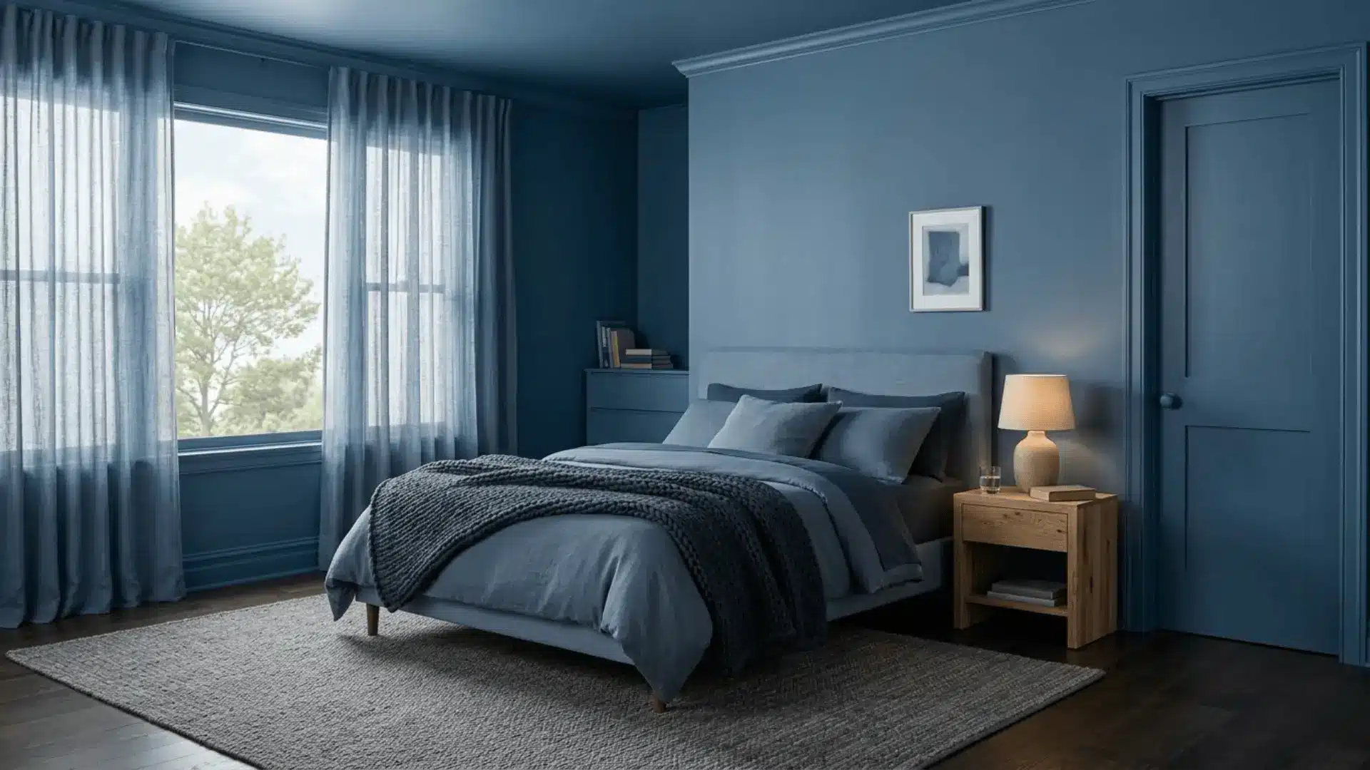
1. Moody Dark Bedroom Look
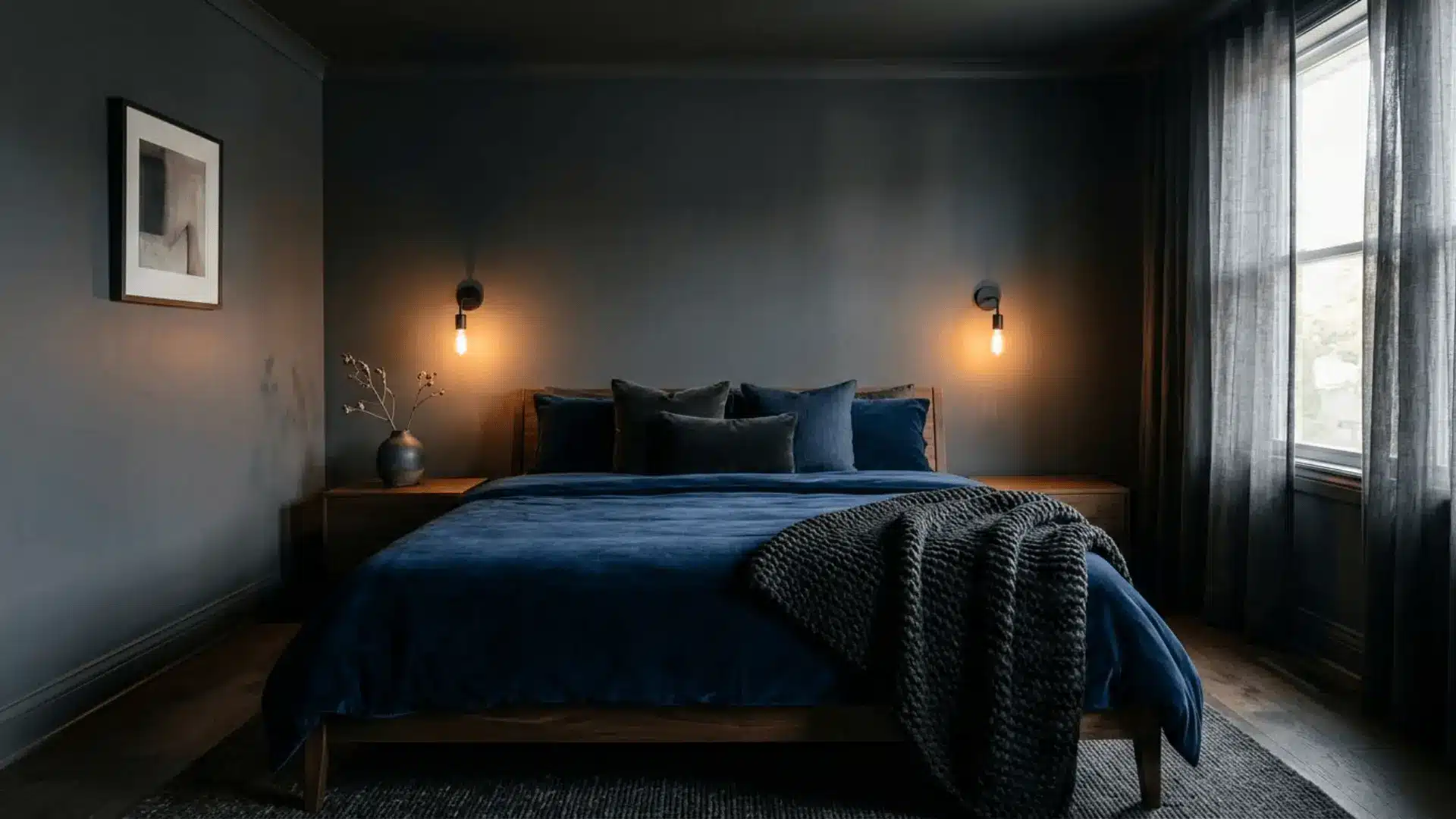
Color Palette: Charcoal, deep navy, or near-black tones head to toe
For anyone drawn to bedrooms that feel like a proper escape, this one delivers. Drench every surface in charcoal or navy and let the depth do the heavy lifting.
Layer in matte black hardware, dark velvet cushions, and low ambient lighting to really lean into the drama. It is brooding in the best possible way.
2. Light and Airy Neutral Bedroom
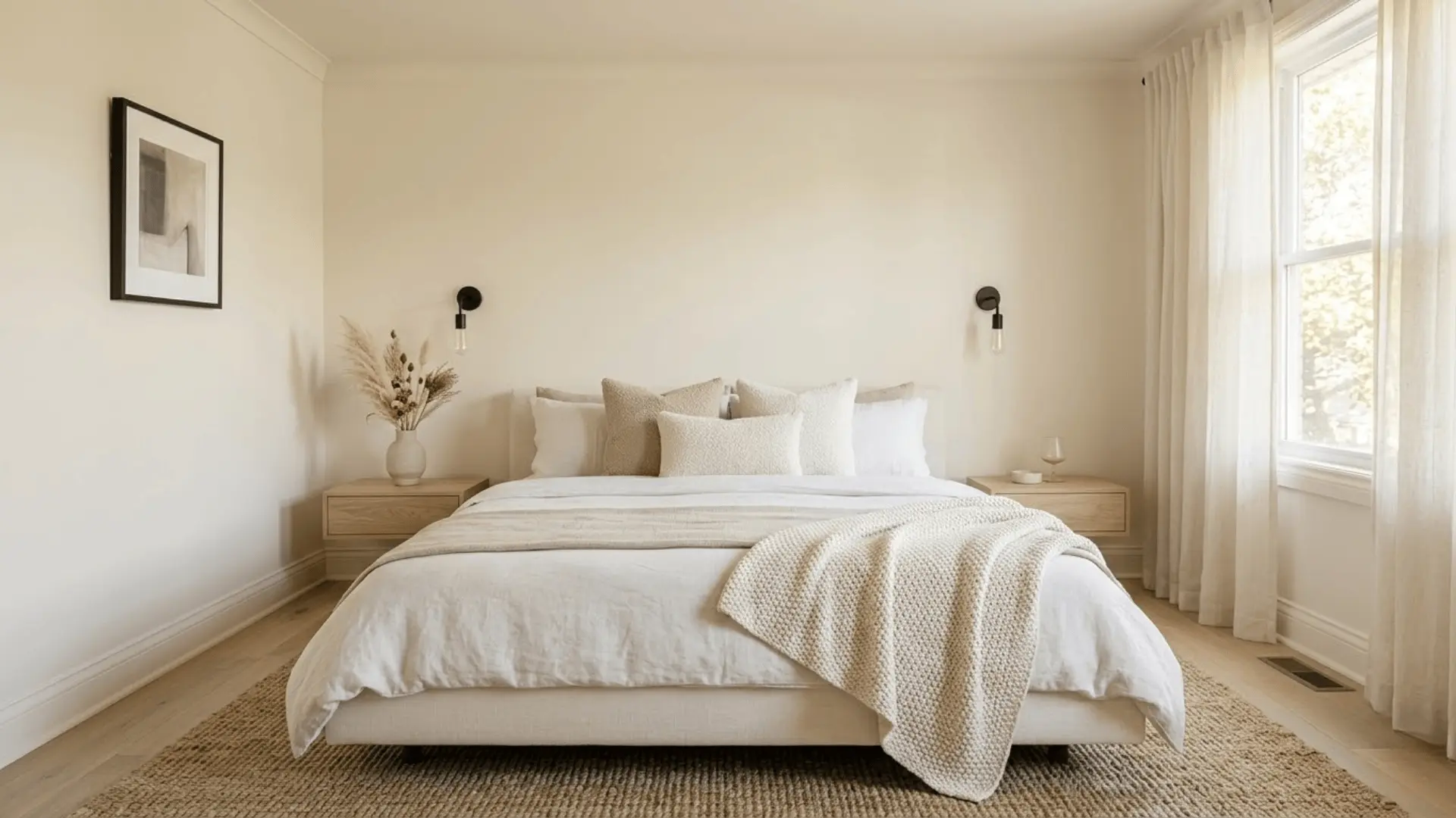
Color Palette: Creams, warm whites, and soft ivory layered throughout
This is color drenching at its most understated. Warm whites and creams wrapped across the walls, ceiling, and trim create a luminous, cloud-like quality that feels endlessly calm.
The trick is keeping textures varied, think bouclé, linen, and sheer curtains, so the room stays visually interesting without ever feeling busy or overdone.
3. Monochromatic Green Sanctuary
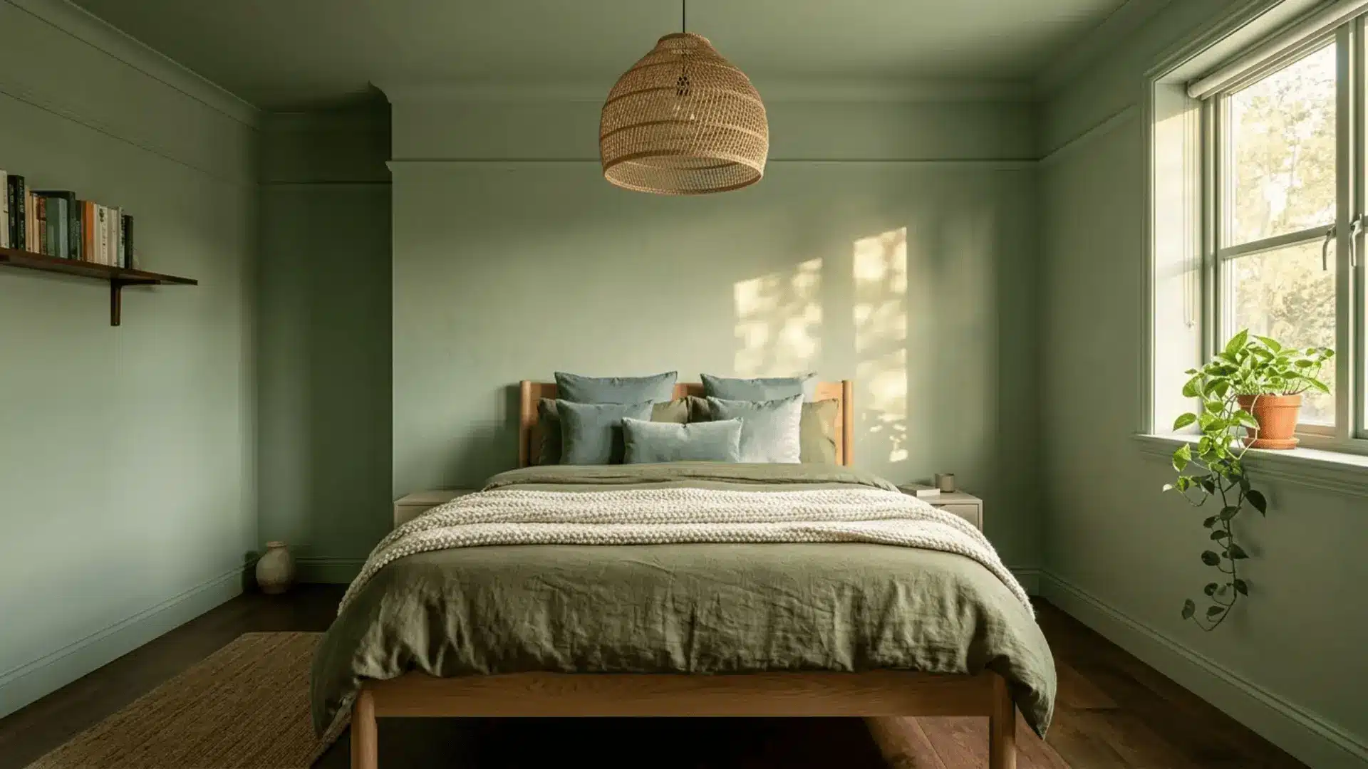
Color Palette: Sage, eucalyptus, and olive tones blended together
Green, in its softer, earthier forms, makes for one of the most livable color drench palettes out there. Moving from sage on the walls to deeper olive in your soft furnishings creates a tonal range that feels lush and considered.
Pair with natural wood and woven textures, and the room genuinely starts to feel like a retreat.
4. Bold Statement Bedroom
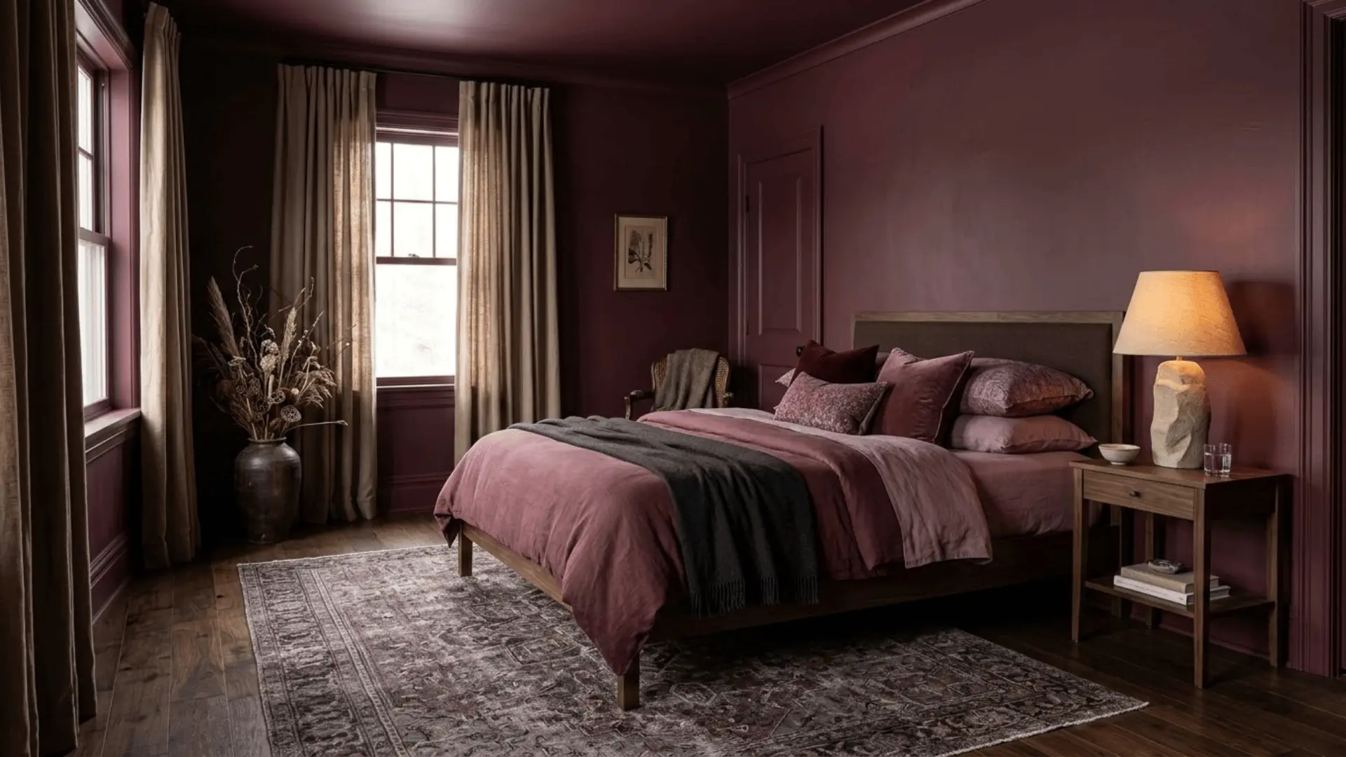
Color Palette: Terracotta, burgundy, or deep plum carried through the entire space
This is for the person who wants their bedroom to leave an impression. Rich, warm hues like terracotta and burgundy bring an almost gallery-like confidence to a space.
Deep plum, on the other hand, leans romantic and editorial. Ground any of these with natural materials and keep decor minimal so the color remains the clear centerpiece.
Common Mistakes to Avoid
Color drenching is more forgiving than it looks, but a few missteps can quietly work against the whole effect. Keep these in mind before you pick up a brush.
- Mixing undertones across your paint, fabric, and furniture pulls the room apart instead of together.
- Skipping the ceiling is the most common shortcut that immediately breaks the drenched illusion.
- Neglecting texture leaves the room feeling flat and one-dimensional, no matter how beautiful the color is.
- Poor lighting choices can make even the most carefully chosen shade look dull or entirely different than intended.
- Over-accessorizing with contrasting decor disrupts the cohesion that makes color drenching so visually powerful.
Avoiding these keeps your space looking intentional, polished, and Pinterest-worthy in all the right ways.
Color Drenching vs. Accent Walls
Both approaches use color to convert a bedroom, but they create very different outcomes.
Here is a side by side look to help you figure out which direction suits your space and vision better.
| Factor | Color Drenching | Accent Wall |
|---|---|---|
| Effect | Full immersive atmosphere | Single focal point |
| Best For | Moody, design-forward spaces | Adding color without full commitment |
| Room Size | Works in any room size | Better for larger rooms |
| Effort | Requires planning and consistency | Quick and easy to execute |
| Flexibility | Long-term commitment | Easy to repaint or change |
| Pick This When | You want color to tell the whole story | You want a selective, contained impact |
Is Color Drenching Right for Your Bedroom?
Color drenching works beautifully for anyone who loves deeply cohesive, atmosphere-driven spaces and is comfortable letting one color take center stage.
It suits cozy bedrooms, design-forward homes, and anyone drawn to that immersive, intentional aesthetic.
That said, if you naturally gravitate toward contrast, pattern mixing, or frequently redecorating, it may feel like too much of a commitment.
Before deciding, honestly consider your room’s natural light, size, and your own design personality. When those three things align with the right color, the result is almost always stunning.
Final Thoughts
A color-drenching bedroom is really an invitation to be a little braver with your space.
When it comes together, it stops feeling like a design choice and starts feeling like a mood, one you actually want to come home to every day.
Go deep and dramatic, keep it soft and tonal, or anywhere in between; the result is always a room that feels genuinely considered. If you are thinking about trying it, honestly, just start with a sample pot and see how it feels.
Have you tried color drenching in your home? Drop your experience in the comments below!