There’s something wonderfully freeing about painting landscapes when you strip away the complexity.
Gentle hills, dreamy skies, and quiet waters become your playground, no pressure, just pure creative flow. These soft, forgiving subjects let you experiment with color mixing and brushwork without getting tangled in tricky details.
If you’re picking up a brush for the first time or you’re a seasoned painter craving a meditative escape, simple landscapes offer that sweet spot between ease and beauty.
They’re your invitation to slow down, breathe, and create something that feels peaceful both during and after the process.
Here are some beautiful ideas that’ll awaken your creativity and guide you toward painting your own tranquil scenes.
What Makes a Landscape “Simple”?
A simple landscape thrives on essentials: a flowing horizon line, an open sky, and gentle ground that doesn’t demand intricate detail.
You’re working with clean, uncluttered compositions where a few brushstrokes can suggest distant trees or rolling hills.
Limited color palettes become your best friend here, allowing you to focus on blending soft gradients rather than juggling dozens of hues.
These scenes teach core skills like creating depth with color temperature and establishing perspective simply.
Repeatable patterns, like gentle waves or layered mountains, build your confidence through rhythm and familiarity, making each stroke feel natural and intuitive as you paint.
Essential Supplies for Painting Easy Landscapes
Getting started doesn’t require a studio full of expensive materials. A handful of thoughtfully chosen supplies will set you up beautifully for creating serene landscapes.
| Supply | Options | Best For |
|---|---|---|
| Paint Type | Acrylics, Watercolors, Gouache | Fast-drying layers, Soft dreamy blends, Opaque matte finish |
| Surface | Watercolor paper (140lb+), Canvas boards, Pre-stretched canvas | Affordable practice, Professional texture, Durable base |
| Brushes | Flat (½” – 1″), Round (sizes 4-8), Liner | Skies and large areas, Hills and foliage, Fine details |
| Optional Tools | Masking tape, Sponges, Fan brush, Palette knife | Crisp horizons, Textured trees, Grass effects, Thick dimension |
Simple Landscape Ideas Anyone Can Paint
These ideas range from soft, dreamy scenes to bold, colorful horizons, each one designed to feel approachable and rewarding.
Pick what calls to you and let your brush tell the story.
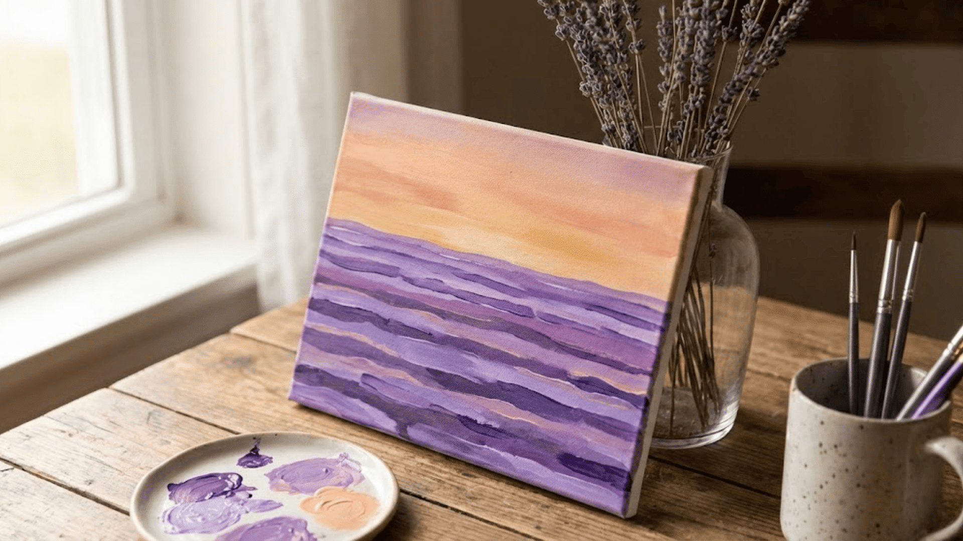
1. Sunset Gradient Over Still Water
Blending warm oranges into cool purples creates that magical dusk feeling, and the mirror-like water below practically paints itself. Working wet-on-wet allows seamless transitions, letting colors kiss naturally at their edges.
If reflections look wobbly, that’s actually more realistic than perfect symmetry. Artist Sara Chen found the forgiving horizontal strokes incredibly calming; she described it as “more meditation than painting.”
This technique builds confidence in gradient work without demanding precision or complex shapes, making it ideal for understanding how colors flow together naturally.
2. Minimalist Mountain Silhouettes
Layering dark mountain shapes against a pastel sky teaches depth through simple overlapping forms. Start with the farthest mountains in lighter tones, then gradually darken as you move forward.
Atmospheric perspective at its easiest. Beginner painter Tom Rivera was amazed at how professional his first attempt looked with just three shades of blue-gray. No details needed on those peaks; clean, confident shapes do all the work.
This approach proves that restraint often creates more impact than complexity, teaching value relationships without overwhelming technical demands.
3. Peaceful Meadow With Wildflowers
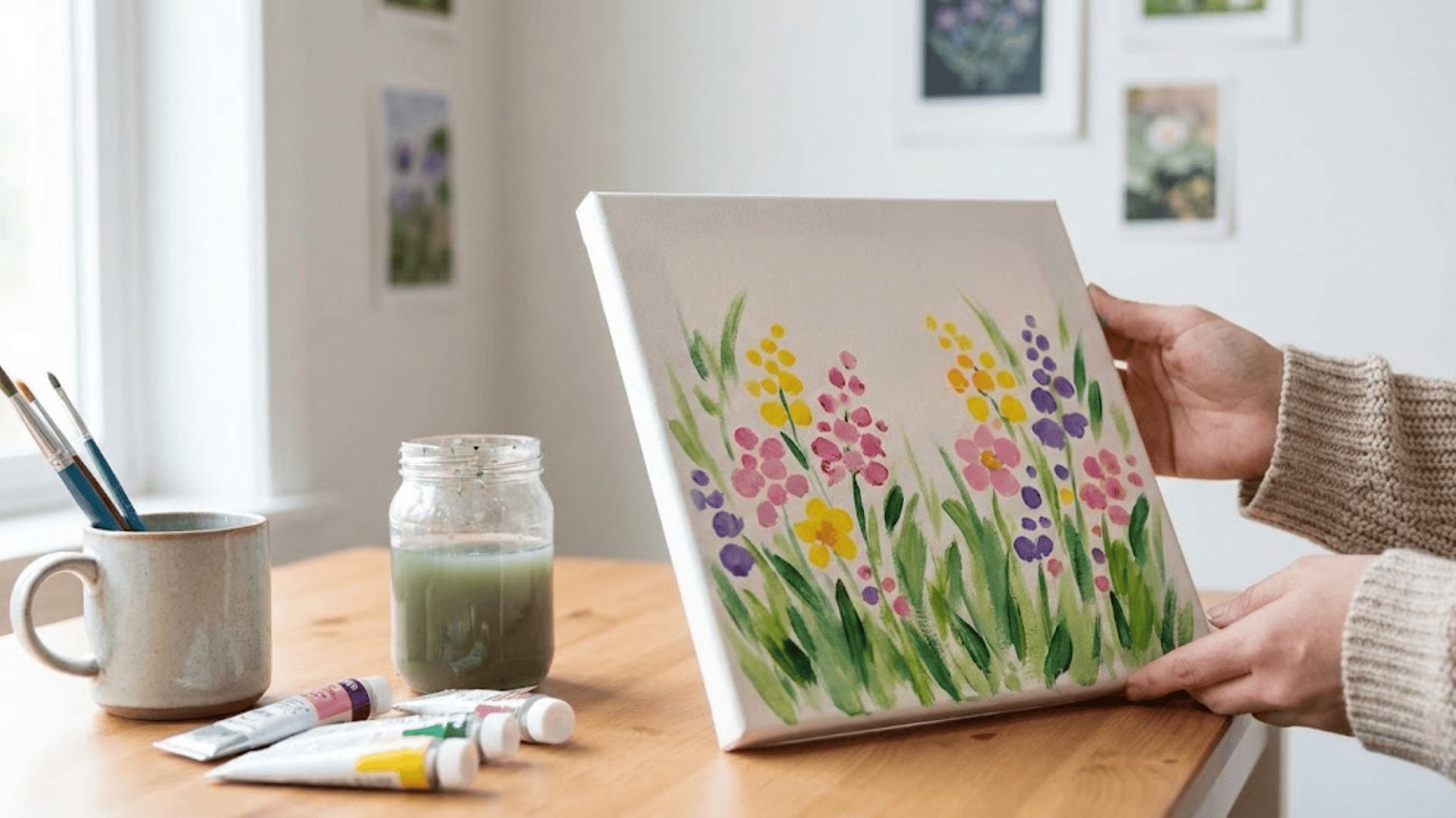
Quick flicks for grass and cheerful dots for flowers make this lively. Artist and instructor Maya Chen often recommends this to her students because “mistakes become happy accidents; every stroke adds character.”
Use a fan brush for instant texture in the grass, varying greens from yellow-toned to blue-toned for natural depth. Cluster flower dots in organic groups rather than even spacing for a wild, natural look.
The loose, impressionistic style means perfection isn’t the goal. Capturing feeling is what matters here.
4. Beach Horizon With Soft Waves
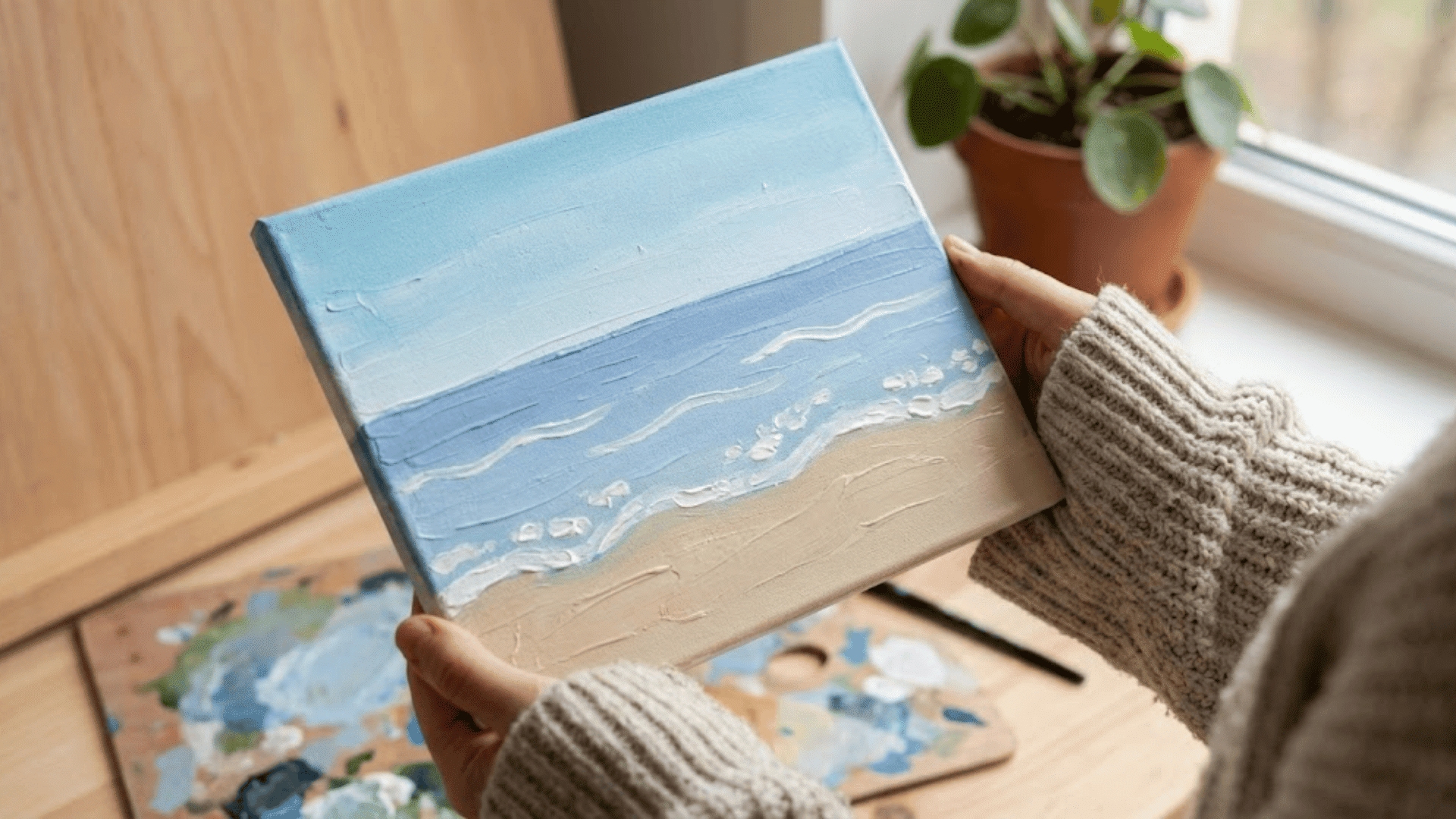
Horizontal bands of sand, sea, and sky create instant structure that’s nearly impossible to mess up. The gentle foam on waves comes from a nearly dry brush dragged lightly across darker blue.
Pure magic with minimal effort. Keep color transitions subtle where water meets sky for that hazy, distant feeling. Painter Priya Sharma found the rhythmic horizontal strokes genuinely soothing during a stressful period.
This composition teaches value relationships beautifully while staying wonderfully uncomplicated, perfect for understanding how horizontal layering creates peaceful scenes.
5. Misty Pine Forest
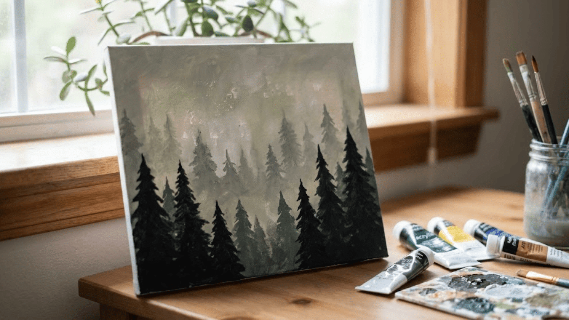
Softening edges as trees recede into fog creates atmospheric depth using just one dilution technique. Start with darker, sharper trees in the foreground, then add water to paint for increasingly ghostly background shapes.
Designer Liam Rodriguez notes that “the fadeout effect is forgiving. If trees look uneven, the mist explains everything away.” Triangle shapes stacked vertically suggest pines without fussy needles or branches.
This moody scene proves that less clarity can mean more emotion, teaching atmospheric perspective through simple repetition.
6. Desert Dunes at Golden Hour
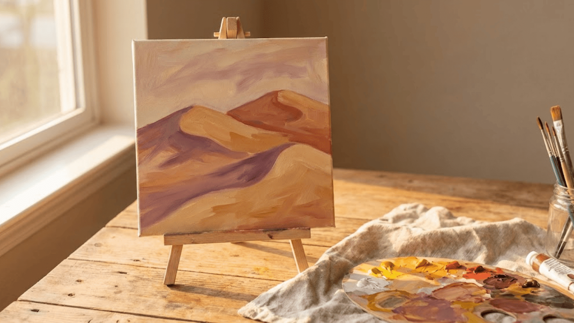
Smooth, flowing curves and warm sand tones make this surprisingly relaxing to paint. The secret is using your brush to follow the dune’s natural arc, applying slightly darker tones on shadow sides for instant dimension.
Limit the palette to three sandy colors: light ochre, deeper terracotta, and a touch of lavender for shadows. Watercolor artist Elena Vasquez recommends this for understanding warm color harmonies.
The simplicity of curves against a clear sky creates a zen-like minimalism that feels both calming to create and view.
7. Rolling Hills Under a Blue Sky
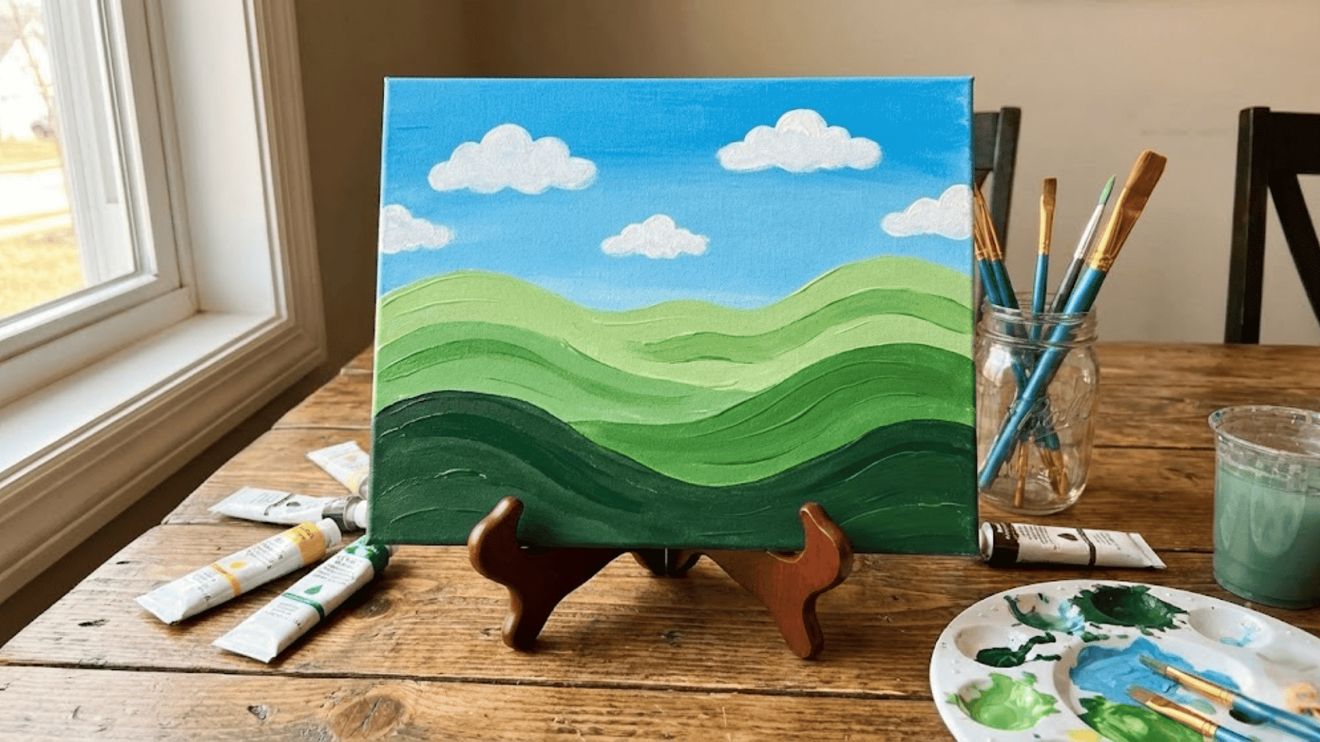
Gentle, rounded shapes layered front to back create depth via color temperature. Photographer-turned-painter Jen Walsh finds this “ridiculously approachable; just wavy lines and brighter greens as you come forward.”
Add a few fluffy clouds using a dry-brush technique for instant charm without complexity. Vary greens by mixing in yellows, blues, or even touches of white to keep things interesting.
The forgiving curves mean wonky lines just look like natural landscape undulation, making this incredibly beginner-friendly.
8. Winter Wonderland With Bare Trees
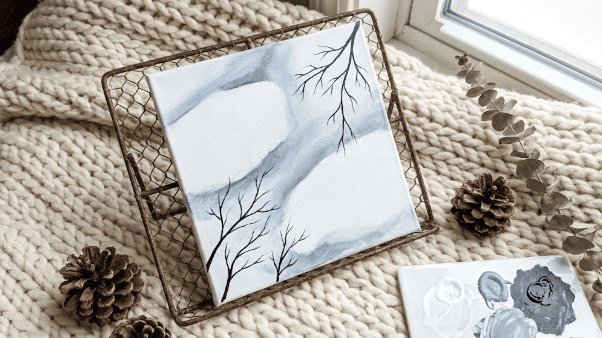
Leaving white space for snow and adding soft gray-blue shadows creates that crisp winter feeling effortlessly. Bare branches are just thin lines splitting into smaller lines.
No leaves to worry about, no complex foliage. Use diluted paint for distant trees to push them back, keeping foreground branches darker and sharper.
Art student Marcus Chen called this his “breakthrough painting” because he realized simple didn’t mean boring. The white snow and dark branches provide visual contrast without detailed rendering.
9. Lavender Field Perspective Study
Rows of purple receding toward the horizon teach one-point perspective in the most beautiful way possible. Simply paint horizontal purple strokes that get smaller and closer together as they move upward on the canvas.
Landscape architect Nina Patel suggests this to design students because “it makes perspective click instantly. You see the concept, not just the theory.”
Add a warm sky and maybe a distant farmhouse for context. The repetitive strokes become meditative while sneaking in valuable technical lessons about spatial relationships.
10. Moonlit Night Sky With Water Reflection
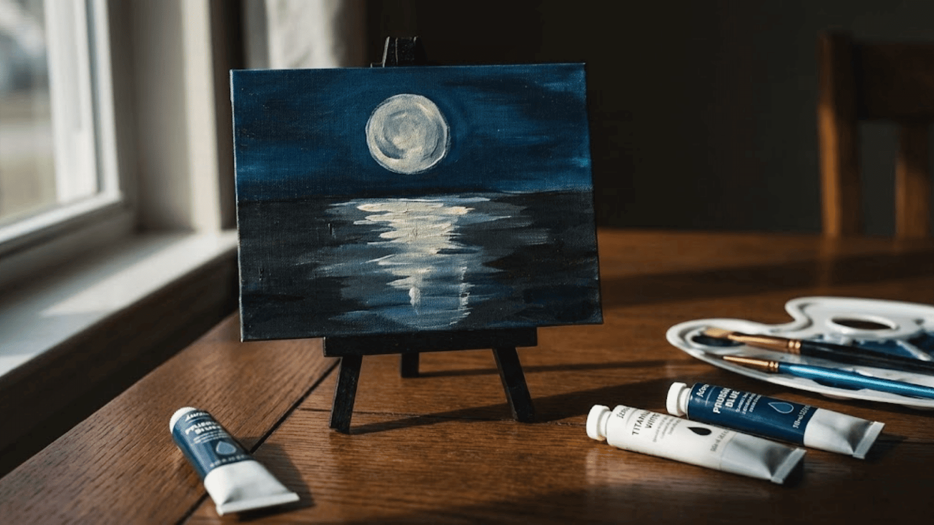
Dark blues and blacks feel dramatic yet hide imperfections beautifully in their shadows. The glowing moon is just a pale circle with soft edges, its light creating a shimmering vertical path down the water.
Keep the palette limited. Prussian blue, black, and white are really all you need. Hobbyist painter Rachel Kim found working with darkness surprisingly comforting and forgiving.
The mirrored reflection below grounds the composition while doubling visual interest with minimal extra effort, teaching how light behaves on water.
11. Autumn Forest Path
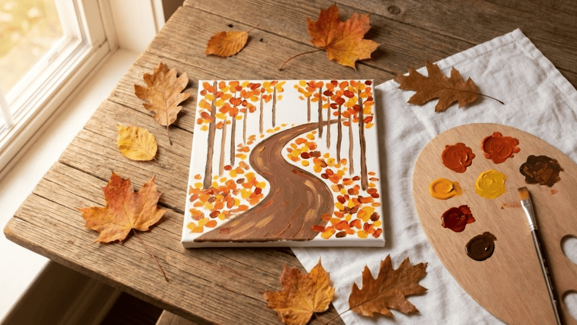
Warm oranges, reds, and yellows scattered loosely suggest fallen leaves without tedious detail work. The path itself is just a lighter, cooler shape winding through warmer surroundings. Instant focal point.
Weekend painter David Lee shared that “loose, confident strokes made this feel more authentic than when being overly careful.” Layer foliage colors wet-on-wet for natural blending that mimics autumn’s mixed palette.
A few vertical tree trunks in the background add structure without demanding precision, creating depth through simple vertical elements.
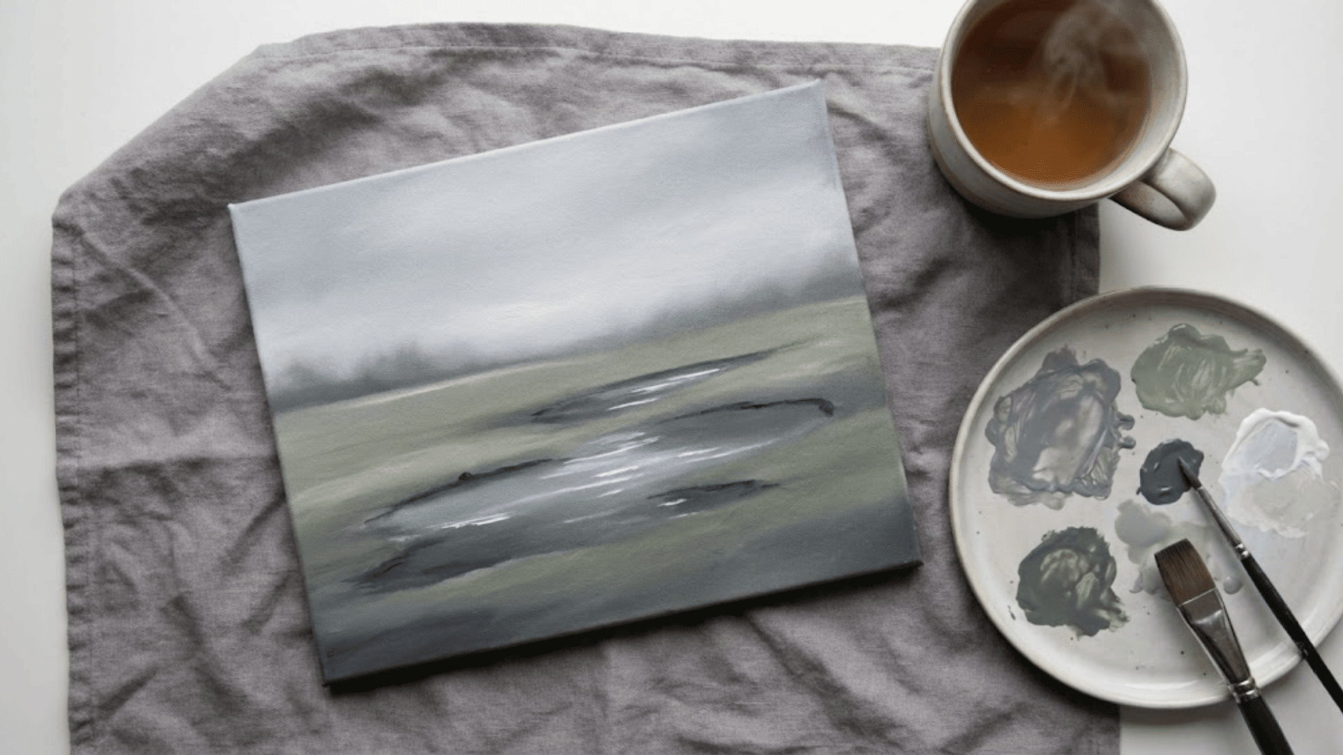
12. Serene Lake With Distant Mountains
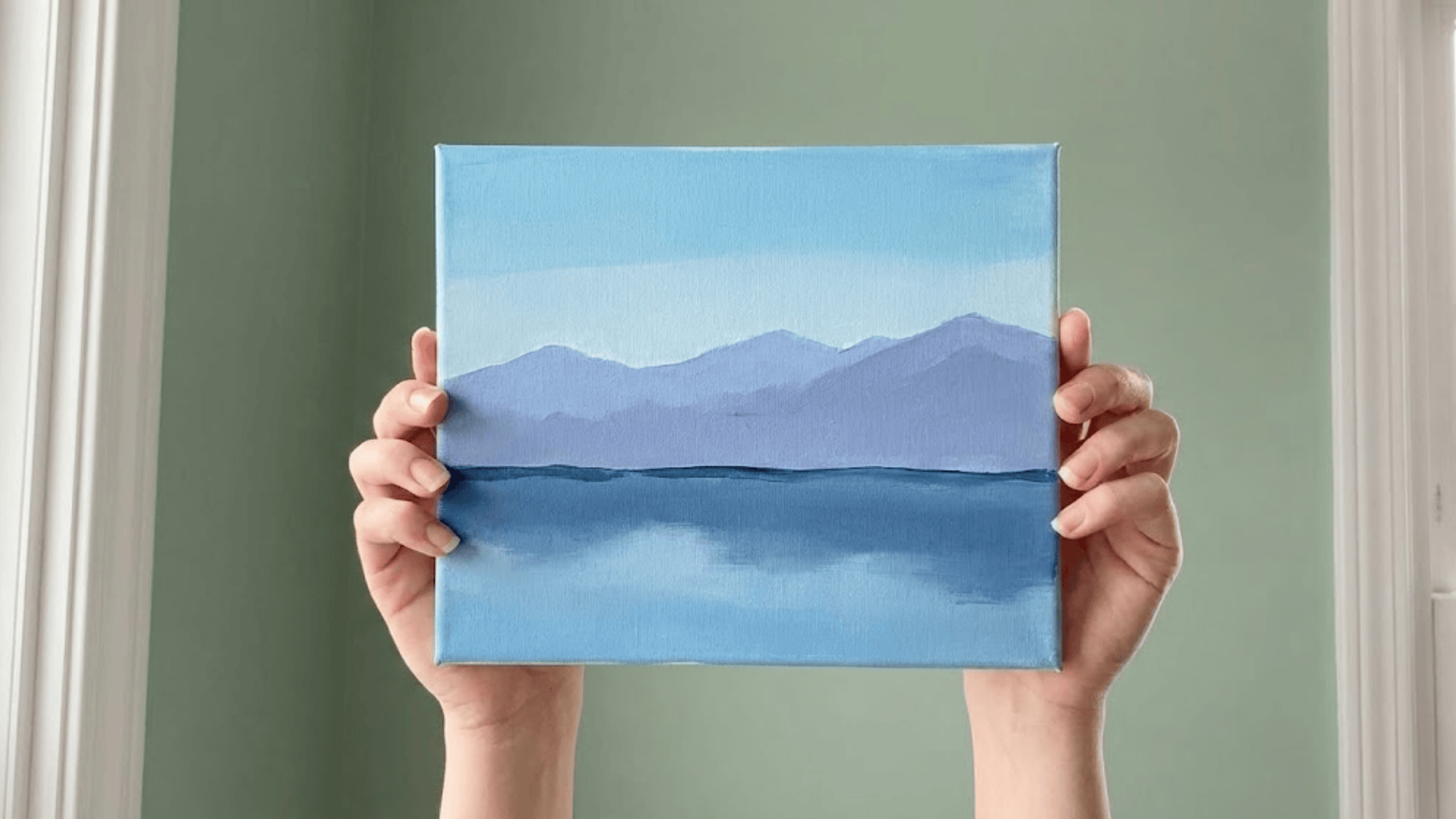
Splitting the canvas into distinct horizontal zones (sky, mountains, water) creates instant harmony. The mountains sit soft and hazy in middle-distance blues and purples, while the lake mirrors everything above with slightly darker values.
Keep reflections slightly blurred and broken up for realism. Perfect mirrors look artificial. Art therapist Linda Torres uses this with clients because the clean horizon line provides structure while the soft colors promote calm.
The simple composition lets the focus stay entirely on color mixing and value relationships.
13. Snow-Capped Mountains With a Pastel Sky
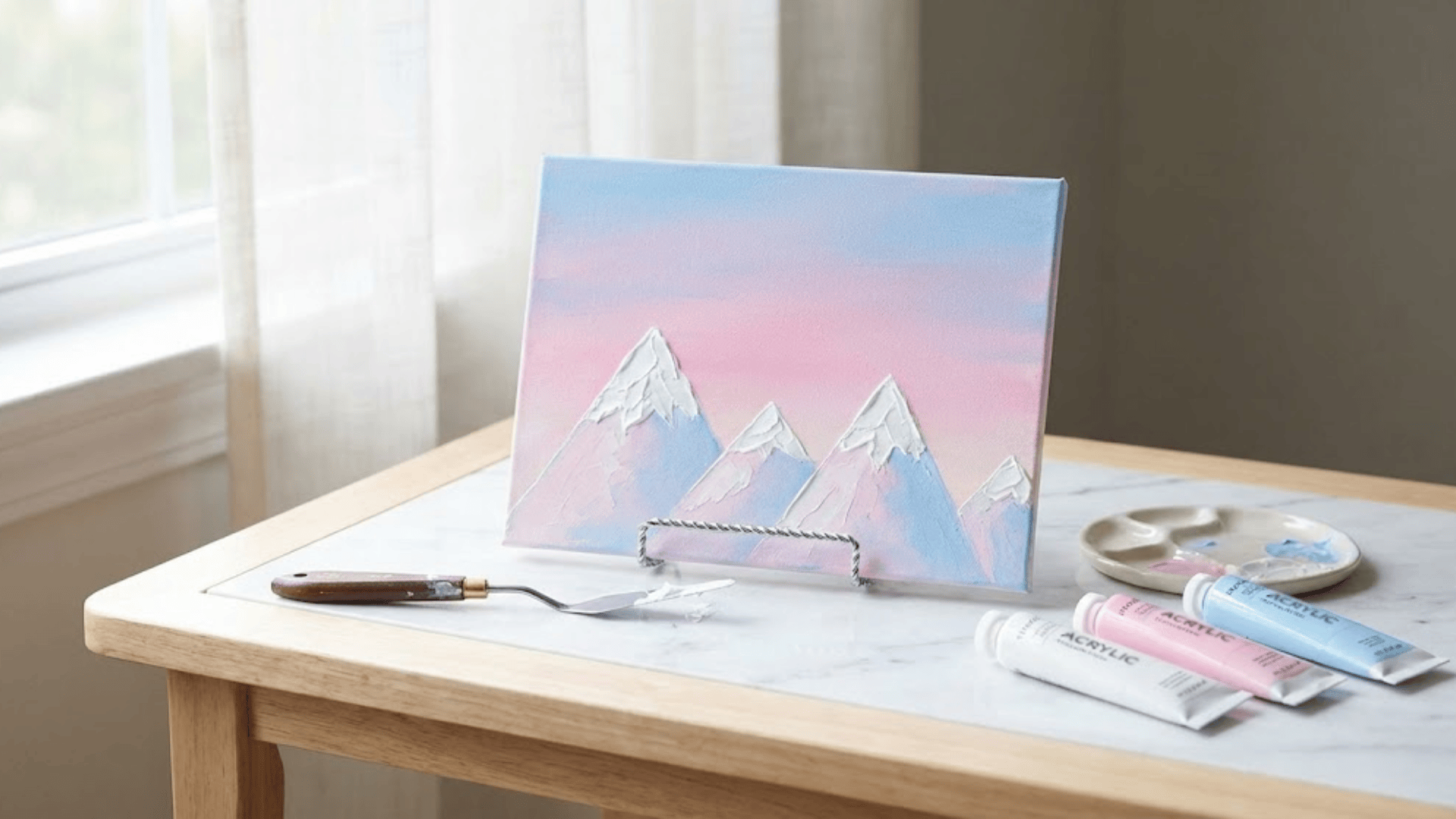
Sharp white peaks against soft pink-and-blue skies create a stunning contrast with basic triangle shapes. A palette knife makes applying thick white snow ridiculously easy and texturally interesting.
Art therapist Rebecca Morgan uses this with anxiety clients because “the bold shapes and soft colors balance energy beautifully.” Let mountain edges stay crisp and definite.
This is one place where precision actually enhances the effect. The pastel sky keeps everything feeling gentle despite the dramatic peaks, creating emotional balance.
14. Countryside Fence Line
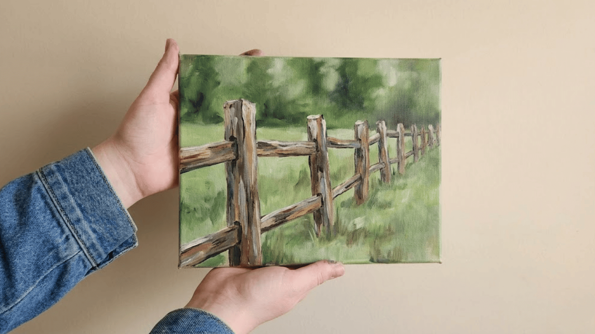
A simple fence guides the eye through the painting while the expansive backdrop stays loose and easy. Just vertical posts connected by horizontal rails, maybe weathered and imperfect for added charm.
Use the fence to practice straight lines and spacing while keeping grass, sky, and distant trees beautifully vague.
Landscape painter Maria Gonzalez notes this composition proves that one detailed element can anchor an entire simple scene. The fence gives structure while everything else can remain impressionistic and forgiving.
15. Rainy Day Landscape With Soft Puddles
Muted grays, soft greens, and touches of lavender create that peaceful, overcast atmosphere. Puddle reflections are just darker paint with lighter streaks dragged through.
Surprisingly convincing with minimal technique. Designer Alex Moreno calls this “the perfect moody painting when you want atmosphere over accuracy.”
Keep everything slightly blurred and soft-edged to suggest moisture in the air. The subdued palette is incredibly forgiving of color-mixing experiments since nothing needs to be vibrant or exact.
16. Tropical Sunset With Palm Silhouettes
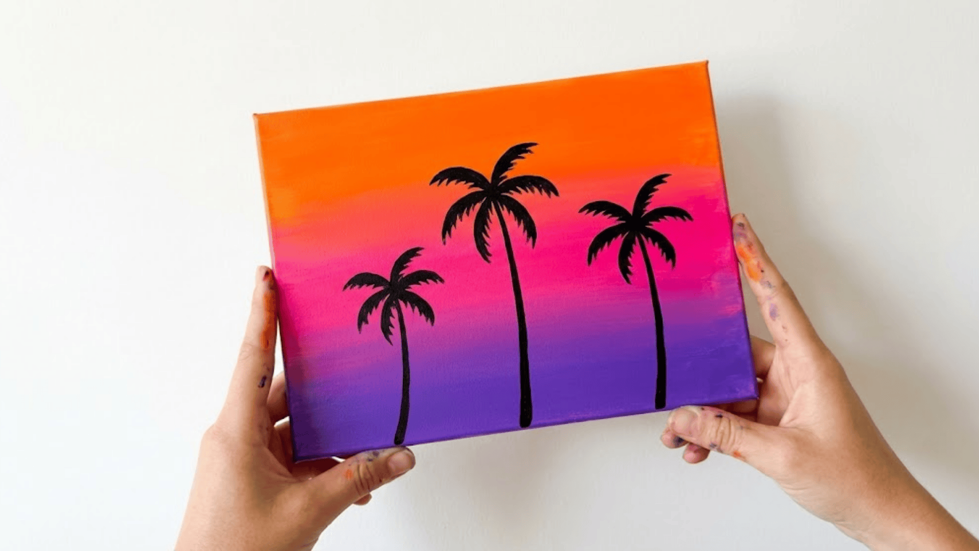
Bold gradient skies transition from deep orange to purple, while palm trees become simple dark shapes against that brilliance. The silhouette approach means no detail work on the palms.
Just distinctive frond shapes that everyone recognizes instantly. Work the gradient first while wet, then add completely dry black shapes on top for clean edges.
Artist Carlos Reyes emphasizes that the high contrast hides technical imperfections beautifully. This dramatic approach teaches how negative space and bold contrast can create powerful compositions.
17. Fields of Sunflowers Facing the Horizon
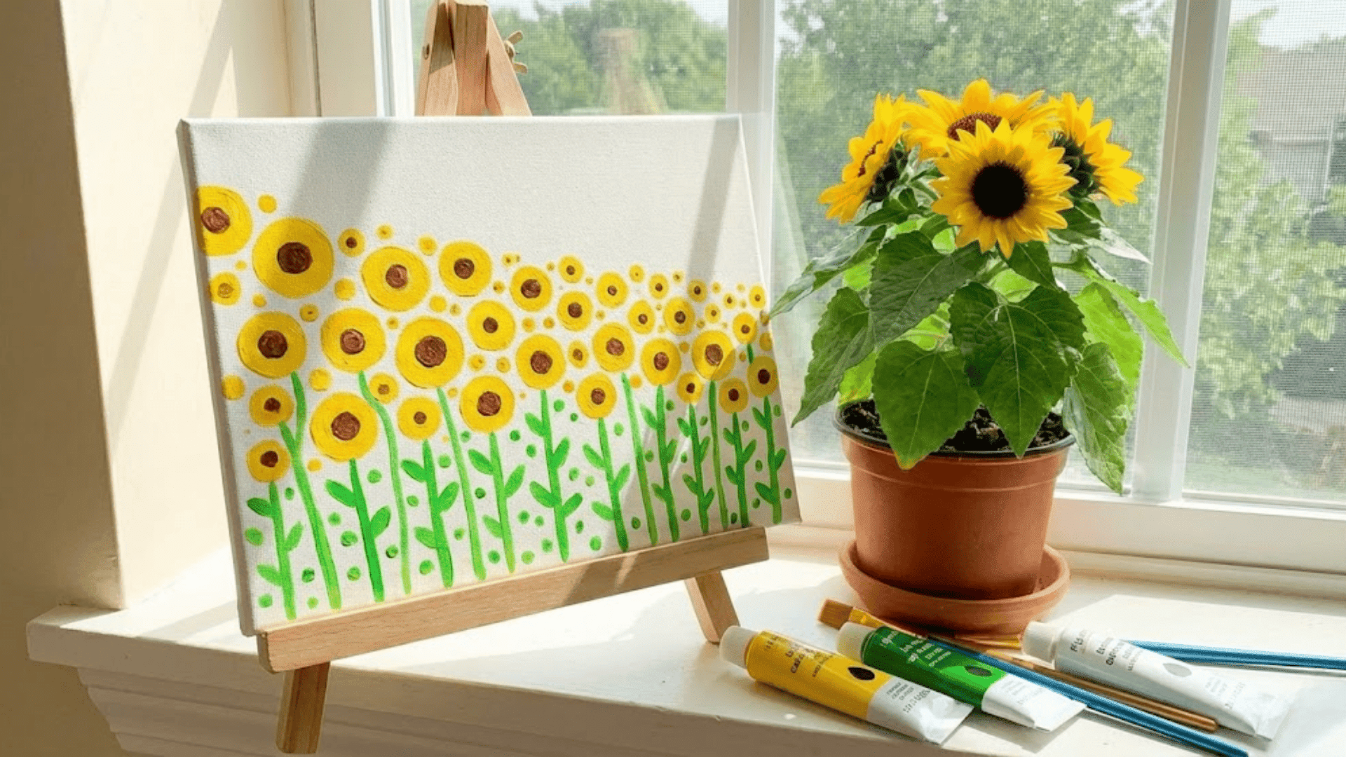
Circular yellow shapes repeated across green suggest entire fields without painting individual petals. Using perspective, make flowers smaller and closer together as they recede, creating natural depth.
Florist-turned-artist Carmen Lee says, “repetition is your friend here. Each sunflower teaches you the next one.” Add touches of brown centers and green stems without fussing over botanical accuracy.
The cheerful subject matter makes this painting emotionally rewarding even when the technique feels uncertain, building confidence through joyful repetition.
18. Foggy Morning Riverbank
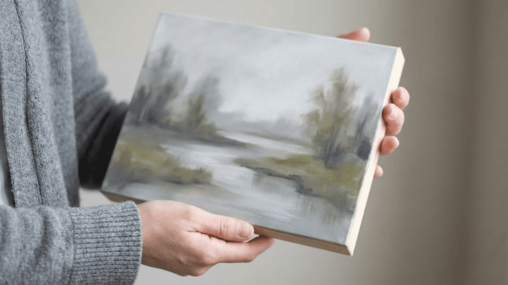
Soft-edged everything. Blurred trees, gentle water, and hazy banks create that mysterious early-morning feeling. The limited visibility means only defining what’s close, letting everything else fade into atmospheric white-gray.
Keep greens muted with gray, water calm and reflective. Plein air painter Jake Morrison found this “freeing because fog excuses everything. No sharp details required.”
The quiet, contemplative mood matches the simple technique perfectly, teaching how softness and atmosphere can carry an entire composition.
19. Bright Spring Orchard
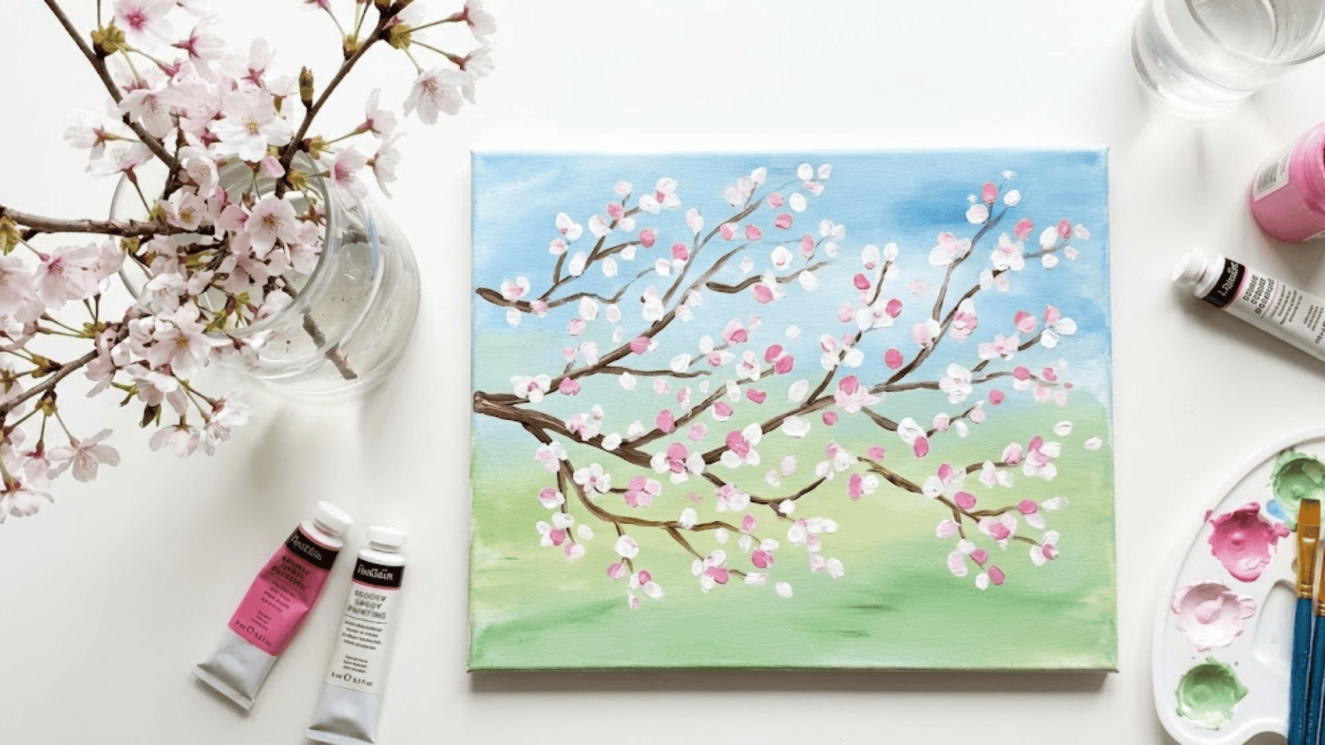
Dotting or dabbing white and pink blossoms across brown branches captures spring’s arrival delightfully. The impressionistic approach means each dab becomes a cluster of flowers without painting individual blooms.
Teacher and weekend painter Sofia Ruiz tells her students, “don’t think, just dab rhythmically and watch it come alive.”
Add a soft green ground and blue sky to frame all that floral celebration. The loose, joyful technique matches spring’s energetic renewal perfectly, making this emotionally uplifting to create.
20. Rocky Shoreline With Gentle Waves
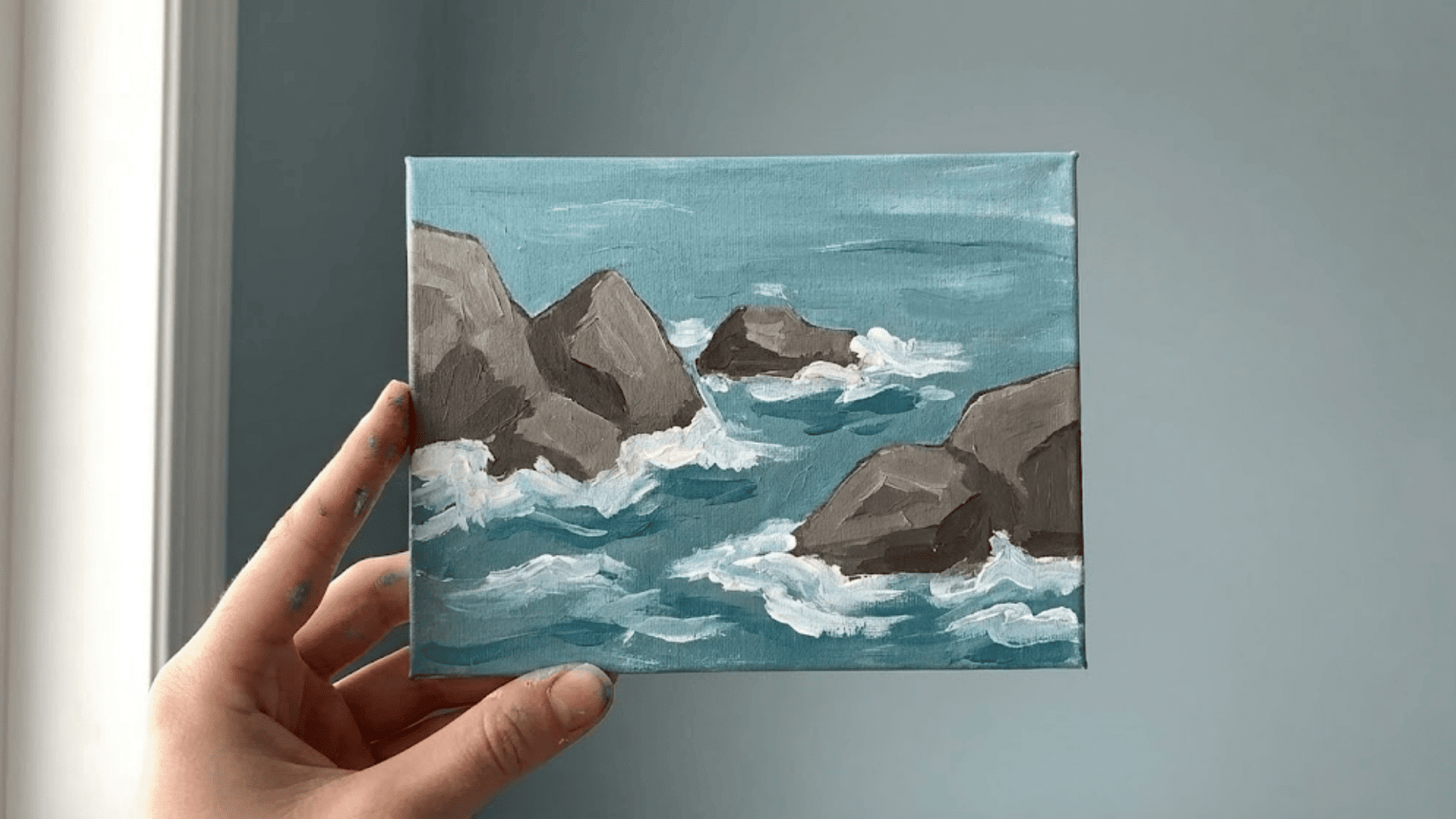
Angular rock shapes in grays and browns contrast beautifully with soft, flowing water. White foam accents along wave edges and around rocks add sparkle with just a few confident strokes.
Keep rocks simple. Irregular shapes with one light side and one shadow side create form instantly.
Coastal artist Megan O’Brien emphasizes that combining solid and fluid elements makes this compositionally interesting while staying technically accessible. The interaction between rocks and water illustrates contrast effectively.
21. Abstract Landscape Blocks of Color

Horizontal bands or geometric shapes in landscape-inspired colors create modern, minimalist scenes. This frees painters completely from realistic rendering. Just pure color relationships and emotional response.
Graphic designer turned painter Yuki Tanaka describes this as “permission to play. No rules about what sky or land should look like.”
Try three to five distinct color zones with clean edges or soft transitions between them. This approach builds color confidence and composition skills without any pressure toward realism.
Tips for Better Shading Patterns and Techniques
Shading transforms flat paintings into dimensional scenes, and the good news is that mastering a few foundational techniques will elevate your landscapes dramatically.
Here are the essentials every beginner should know:
- Identify your light source first to determine where highlights and shadows fall naturally across your scene.
- Use three-tone shading with highlights, mid-tones, and shadows to build realistic dimension quickly.
- Layer light to dark gradually by building up color in thin layers for smoother, cleaner gradients.
- Try tool-assisted shading with sponges for texture, fan brushes for grass, and dry brushing for soft effects.
- Apply warm and cool temperatures by using cooler shadows and warmer highlights for natural realism.
Practice these techniques individually before combining them, and remember that uneven shading can be softened by gently blending edges with a damp brush.
Simple Landscape Ideas for Kids
Getting children excited about painting landscapes means keeping things playful, quick, and wonderfully messy.
Here are kid-friendly approaches that balance creative freedom with achievable results:
| Category | Recommendations | Why It Works |
|---|---|---|
| Child-Friendly Tools | Washable paints, chunky brushes, foam brushes, cotton swabs | Easy grip, simple cleanup, tactile fun |
| Best Colors | Primary colors plus white and green | Simple mixing, bright, appealing results |
| Ideal Subjects | Rainbow skies, simple trees, colorful hills, ocean scenes | Recognizable shapes, no precision needed |
| Fast Projects | Paper plate landscapes, sponge trees, hand-print sunsets | 15-30 minutes, immediate satisfaction |
| Low-Mess Options | Watercolor cakes, paint sticks, and washable markers | Contained materials, stress-free supervision |
Common Mistakes Beginners Make (and Easy Fixes)
Even the simplest landscapes can go sideways when you’re just starting out, but most mistakes are incredibly easy to fix or avoid altogether.
Here’s what trips up new painters and how to stay on track:
- Overworking sky gradients by blending too long; work quickly while the paint is wet, then leave it alone to dry naturally for smoother transitions.
- Adding excessive details that clutter the composition; step back frequently and remember that suggestion often reads better than precision in landscapes.
- Muddying colors by mixing too many hues or layering wet paint repeatedly; rinse brushes between colors and let layers dry before adding more.
- Creating crooked horizons by eyeballing the line; use masking tape or lightly pencil a guideline across your canvas before painting.
- Using pure black for shadows instead of dark blues or purples, mix your darks from complementary colors for richer, more natural depth.
Most painting problems happen from overthinking rather than a lack of skill.
Trust your initial strokes, work with confidence, and remember that stepping away for a few minutes often reveals simple solutions you couldn’t see up close.
Final Thoughts
Simple landscape painting opens a world where creativity meets calm, where a few brushstrokes can capture entire horizons.
You’ve now got techniques, ideas, and the confidence to begin transforming blank canvases into peaceful scenes that reflect your vision.
Start with whichever landscape calls to you most, gather those basic supplies, and give yourself permission to experiment without judgment.
Every artist began exactly where you are now.
Which scene will you paint first? Share your favorite idea or your finished artwork in the comments below; we’d love to see what you create and celebrate your artistic experience with you.