You stood in the paint aisle, narrowed it down to one perfect chip, and felt sure about it. Then you rolled it onto your wall and something went wrong. The warm greige turned faintly pink. The calm blue went gray and cold. The crisp white picked up a yellow cast you never saw at the store. Nothing was mixed wrong. The pigment on your wall is the same pigment that was on that little card. What changed is everything around it: the light, the size of the surface, the floor, the furniture, and the plants in the room. This is one of the most common letdowns in any home project, and it’s almost always avoidable once you know what’s happening between the store and your living room.
What the paint store’s lighting hides from you
Paint stores run on bright overhead fluorescent or LED light, usually somewhere around 4,000 to 5,000 Kelvin. That light is cooler and flatter than what you have at home, and it’s nothing like the warm glow of a lamp or the shifting daylight from your windows. A chip that looks balanced under that buzzing ceiling can read completely different in your space.
There’s a name for this: metamerism. It just means two colors can match under one light and clash under another. The chip isn’t wrong. It’s accurate to the dried paint. The store is simply showing it to you under conditions you’ll never recreate at home.
Scale plays its own trick. A two-inch chip surrounded by a hundred other chips gives your eyes almost nothing to go on. Spread that same color across four walls and it gets louder. Whatever undertone was whispering on the chip starts talking at full volume.
Does the direction your windows face really matter?
More than almost anything else. Natural light is the biggest reason a color shifts, and it never holds still. Morning light leans cool and bluish. Late afternoon light turns golden and warm. So your wall is a slightly different color at 8 a.m. than it is at 6 p.m., even though nothing about the paint has changed.
The direction your windows face sets the baseline. North-facing rooms get steady, cool light that pulls out blues and grays, which is why a cozy beige can feel chilly and flat in them. South-facing rooms get warm, strong light that makes most colors look deep and full, though it can wash out anything very pale. East-facing rooms are bright and cool in the morning. West-facing rooms go golden in the late afternoon. If you only ever sit in a room at night, the morning sun barely matters. Pick for the hours you actually live there.
Then there are your bulbs. A soft white bulb around 2,700K throws a yellow warmth that deepens warm colors and can push cool ones slightly green. A daylight bulb around 5,000K does the opposite and can leave warm tones looking washed out. Test your color under the lights you flip on at night, not just the daytime sun.
The undertones hiding in every can
Every color has undertones, the secondary hints baked into the formula. A white might lean yellow, pink, or blue. A gray might lean purple, green, or blue. These are what make one white look clean and another look dingy in the exact same room.
A quick way to find them: hold your chip against a plain sheet of white printer paper. The undertone jumps out fast. You can also look at the darkest shade on the same paint strip, since the undertone always shows more in the deepest version of the color.
Neutrals are the sneakiest. Greiges, beiges, and soft grays carry the most subtle undertones, and a big wall amplifies them. That’s the real reason a color shifts onwce it’s spread across a wall: the undertone, the light, and the finish are all pushing on it at once. So when your balanced greige starts leaning lavender by mid-afternoon, the can didn’t betray you. The room did.
Your plants and your view are part of the paint job
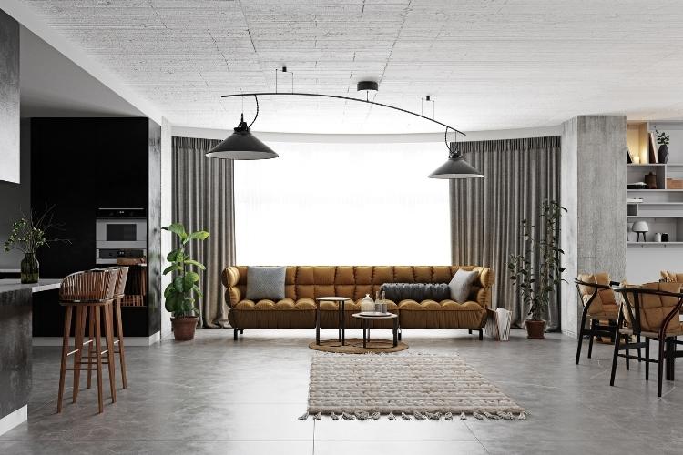
Here’s the part most paint guides skip, and it matters more in a plant-filled home than anywhere else. Color bounces. Light hits a surface, picks up that surface’s color, and carries it onto the next thing it touches. So a big fiddle-leaf fig next to a pale wall throws a soft green cast onto the paint. A row of pothos on a floating shelf does the same. The more greenery you keep, the more green light is quietly mixing into your wall color.
What’s outside the window counts too. A leafy tree, a green lawn, or a packed garden bed filters daylight through all that foliage before it ever reaches your wall, tinting the light green on the way in. A brick building across the street pushes warm red back at you instead. People rarely connect the dots, but the view is part of the lighting.
And it moves with the seasons. A summer canopy outside the glass casts green-tinted light for months, then drops its leaves and lets raw, cool winter light pour in. Snow on the ground bounces a bright, cold glow up onto your walls that can make a color you loved in July feel icy in January. If your room opens onto a garden you actually tend, the color story changes every few months, so judge your samples across more than one week.
Does the finish change the color too?
The same color in flat, eggshell, satin, and semi-gloss looks like four slightly different colors. Flat absorbs light and reads truest to the chip, but it can look a little chalky. Eggshell adds a soft, low sheen. Satin and semi-gloss reflect more light, which can make the color look lighter or more intense depending on where you stand. Most chips are printed on flat stock, so picking from a chip and applying in satin guarantees a small shift.
Coats matter too. One thin coat lets the old color ghost through and changes the hue. Most colors need two solid coats to read true. If you’re covering something dark, prime first, or that old red will haunt your new gray with a pink tint. And if your room takes more than one can, pour them all into a single bucket and stir before you start. Painters call it boxing, and it keeps the color even from the first wall to the last.
How to test a color before you commit the whole room
The only test that tells the truth is the real paint on the real wall. Skip the cardboard.
Buy 8-ounce sample pots of your top two or three colors. Brush a patch at least two feet by two feet, two coats, and let it dry fully before you judge it. Put samples on at least two different walls, one that catches direct light and one that stays shaded, because the same paint won’t look identical on both. Peel-and-stick samples from a service like Samplize work well if you’d rather not paint directly, and you can move them around the room.
Then live with it. Check it in the morning, in the afternoon, and at night with your lamps on. Watch what your plants and your window view do to it as the day turns. A color that holds up across all of that is the one worth buying a full can of.
The short version
Paint color surprises come down to light, undertones, finish, and the stuff in and around your room, including the green things you love. Test large, test on more than one wall, and look at the samples at the times of day you actually use the space. Do that, and the color you carry home is the color you’ll end up living with.