A small shop doesn’t have to look fancy to look trustworthy.
Sometimes the difference is much quieter than that. A clean threshold. A readable name. A planter that looks watered. A door that doesn’t make people pause and wonder whether they’re supposed to go in.
People notice these things fast. They may not say, “That sign is scaled well,” or “Those planters frame the entrance nicely.” They just feel like the place is open, cared for, and ready for them.
That feeling matters for a florist, plant shop, repair counter, tiny bakery, studio, salon, or neighborhood office. The outside of the shop is being worked on before anyone steps inside.
Look at the Shop From Where Customers Actually Stand
The first mistake is judging the storefront from too close.
Owners usually look at their shop while unlocking the door, sweeping the step, or carrying something inside. From that distance, the flaws are familiar. The fading window decal is just “the decal.” The chipped paint near the handle is just “that spot we keep meaning to touch up.” The sign still feels readable because you already know what it says.
Step back instead. Cross the street if you can. Stand where someone parks. Stand where a person on the sidewalk first notices the shop. That’s the honest view.
This is where small exterior choices start to show their value. A shop name should be easy to read without squinting, and the material should match the kind of place it is. Painted wood can feel warm in a flower shop or a handmade goods store, but it needs upkeep. Window vinyl can be clean and simple until the edges curl. On a flat brick, stucco, or painted façade, aluminum letters can give the name a sharper, more permanent look without making the storefront feel oversized. The main thing is proportion: letters that look tasteful in a mockup can disappear once a car, tree, awning, or afternoon glare gets involved.
This is also where address numbers matter more than people think. If a customer has to slow down, check their phone, look at the neighboring storefront, and then guess, the front has already created friction. The International Code Council’s address identification guidance is written for code purposes, but the common-sense point is useful for any storefront: numbers should be visible and legible from the street. A small shop doesn’t need to turn that into a design drama; it just needs the number where people expect to find it.
There’s an easy test here. Take one photo from across the street and one photo from the nearest parking spot or sidewalk approach. Don’t try to make the photos pretty. Just take them straight on. You’ll see what customers see: the blocked sign, the dark doorway, the planter that looks too small, the window display that swallows the name, or the address number hiding in a corner.
A lot of good storefront fixes start with that slightly uncomfortable photo.
Give the Entrance Room to Do Its Job
Shop entrances collect clutter because they are valuable space. Everyone wants to use them.
The florist wants buckets near the door. The café wants a chalkboard. The plant shop wants herbs outside because they smell good and catch the eye. The boutique wants a seasonal display. The repair shop wants a drop-off sign. None of those ideas is wrong on its own.
The problem is when the entrance becomes a little obstacle course.
A customer should be able to understand the front door in two seconds. Where do I go? Are they open? Do I push or pull? Can I step in without brushing against a wet plant, loose sign, delivery box, or wobbly display?
That sounds basic, but it’s one of the most common places where small shops lose polish. The owner sees charm. The customer sees hesitation.
A good entrance has a clear path, a visible handle, hours posted at eye level, and enough space around the door that nothing feels accidental. If there are two doors and only one works, the inactive one should not look like the main entrance. If the shop uses a side entrance, the front should say so without making people feel silly for walking to the wrong place first.
Accessibility belongs in this same conversation, not as a separate checklist that gets handled later. ADA.gov’s small business primer explains that accessible routes should not be blocked by displays, furniture, plants, or other items, and that signs should direct people when only one entrance is accessible. That kind of guidance matters on ordinary days, not just during inspections. A sandwich board may seem harmless until it narrows the only easy path to the door.
The one-hand test is useful. Walk up to the entrance while holding a coffee, bag, phone, or box. Can you open the door easily? Does the mat slide? Is the threshold awkward? Are the hours easy to read without leaning in? Is there enough light to see the step?
Nobody thinks about the mat when it works. Everyone notices when it curls.
Use Plants Like Part of the Storefront, Not Extra Decoration
Plants can make a small shop feel loved. They can also make it look forgotten.
A half-dead fern by the door says more than the owner probably wants it to say. So does a row of mismatched pots filled with dry soil, old tags, and one surviving annual. The good news is that plants do not need to be complicated to work.
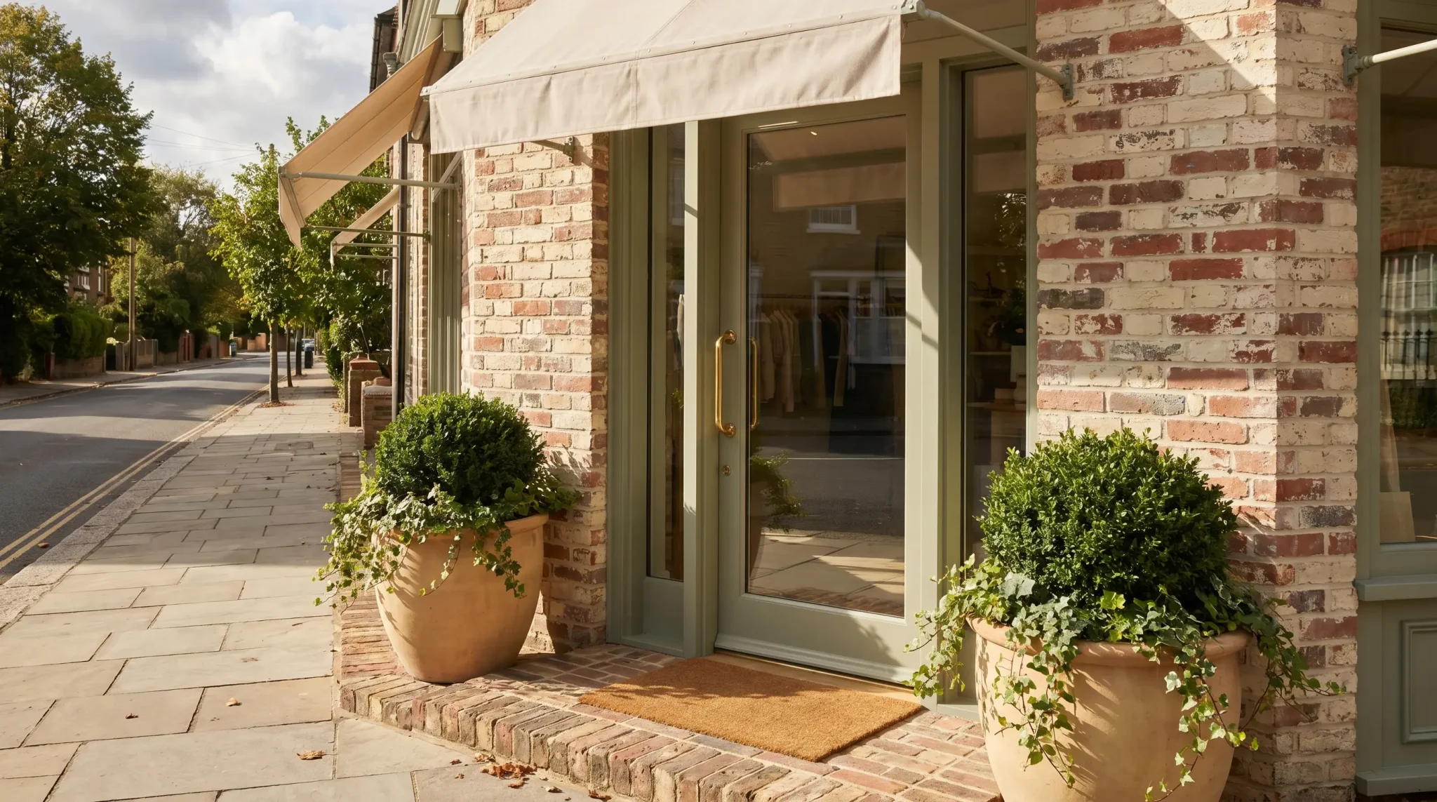
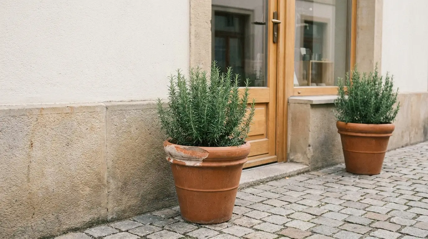
For most storefronts, repetition looks better than variety. Two sturdy planters by the door. One narrow bed below the window. A few herbs in matching pots outside a café. A simple evergreen container that stays good through several months. These choices calm the front down instead of making it busy.
This is the same kind of thinking that helps a house feel pulled together from the curb. SeedSheets’ guide to simple flower bed ideas, front of house talks about layering, edging, and choosing plants based on the space, instead of just grabbing whatever looks nice at the garden center. A small shop benefits from the same restraint. The plants should frame the entrance, not compete with the sign or block the window.
A garden shop has to be especially careful here. People will judge the plants outside before they trust the plants inside. A florist with tired stems near the entrance has the same problem. A plant studio with healthy, labeled, well-spaced pots feels different from one with crowded trays and soil spilled across the threshold.
Maintenance should decide the plan. If the shop opens early, runs lean, and only has one person on the floor most mornings, the exterior planting needs to be forgiving. Rosemary, ornamental grasses, boxwood, hardy perennials, and seasonal annuals can all work depending on the climate and sun. Fussy containers that need constant deadheading, watering, trimming, and rotating may look great for two weeks and then become another job nobody owns.
Edges matter too. A clean border around a small planting bed can do more than another decorative object by the door. Gravel, mulch, brick edging, or a simple defined line tells the eye that the area is intentional. SeedSheets has covered that same curb-appeal logic in its cheap DIY front yard ideas, where small boundaries, paths, and tidy planting zones can make a space feel more finished without a major project.
The best storefront plants don’t shout. They make the shop feel awake.
Notice What Changes After Dark, in the Rain, and on Busy Days
A storefront can look fine at 11 a.m. and weak at 6 p.m.
The sign that reads clearly in soft morning light may vanish in shadow by late afternoon. The step that looks obvious on a dry day may become hard to see in the rain. The sidewalk display that feels charming when the street is empty may become annoying when two people are trying to pass with bags or a stroller.
Good curb appeal has to survive normal conditions, not just the moment after someone sweeps.
Lighting is usually the first thing to check. The goal is not drama. The goal is usefulness. The door should be visible. The address should be readable. The path should not have a dark patch where someone has to step up or turn. If the shop is open after sunset but the front looks closed, that’s a problem a pretty window display won’t fix.
The weather shows weak spots, too. A paper sign taped inside the glass may curl from humidity. A chalkboard may smear. A planter may drain across the walking path. A faded awning may look worse when wet. These are not huge failures, but they chip away at the impression that someone is minding the place.
There’s also the weekly stuff. Fingerprints on the door. Dust on the sill. Dead leaves in the planter. Tape residue from an old notice. A bulb that has been out so long no one sees it anymore. These are not glamorous fixes, but they are the difference between “small and cared for” and “small and tired.”
A ten-minute Friday check can catch most of it. Door, windows, mat, sign, lighting, plants, sidewalk, and anything taped to the glass. Keep, fix, remove, replace. That’s enough of a system for many shops.
The front does not need to be perfect. It needs to look like someone looked at it recently.
Wrap-Up Takeaway
A small shop feels more established when the outside stops making customers work. The name is clear, the door is easy to understand, the plants look alive, the path is open, and the little worn-out things do not sit around for months. None of that requires a full renovation or a huge design budget. It does require seeing the storefront the way a first-time visitor sees it, not the way the owner has learned to overlook it.